6 Activities: Classification & Prediction
6.1 Classification Trees
6.1.1 Discussion
NOTE:
You will need the following packages installed and loaded for this activity:
library(dplyr)      #for data wrangling
library(ggplot2)    #for visualizations

library(fivethirtyeight)    #for data
library(ISLR)               #contains the data we'll need
library(mlbench)            #contains the data we'll need
library(tree)               #for classification trees
library(caret)              #for confusion matrices
library(e1071)              #to make caret run
WARM-UP
The comic_characters data in the fivethirtyeight library contains data on comic book characters:
?comic_charactersThe corresponding fivethirtyeight story highlights the fact that there are some regretful choices comic book artists have made in their character developments. Let’s examine some of those…
Determine the 5 most common hair colors and 5 most common eye colors (not including NA). Create a subset that contains only the characters with a combination of these hair and eye colors.
Among these characters, how is hair color associated with character alignment (good/bad/neutral)? Construct a visualization and obtain a numerical summary of the good/bad/neutral breakdown for each hair color.
Similarly, visualize how eye color is associated with character alignment.
Finally, visualize how sex is associated with character alignment.
Suppose you’re given the following information on some new comic book characters:
## # A tibble: 3 x 3
##          eye       hair               sex
##        <chr>      <chr>             <chr>
## 1  Blue Eyes Blond Hair   Male Characters
## 2 Brown Eyes Black Hair Female Characters
## 3 Brown Eyes Black Hair   Male Characters
Do you think these characters are good, bad, or neutral? Why?
Once you answer these questions, check out the actual characters to determine if you’re correct:comic_characters %>% filter(page_id %in% c(2460, 1900, 1943) & publisher=="Marvel")Now let’s learn how to do a more rigorous classification!
CLASSIFICATION
Classification is an essential data science technique. The basic idea: use observations on a set of variables/features to classify a case into one category. For each of the following classification tasks, specify some variables we could measure that would be useful in our classification.
classify an email as spam or not spam based on…
Spam or not spam?

Spam or not spam?
- classify a credit card charge as fraudulent based on…
- classify a person as a Sagittarius based on…
classify an internet user as a potential customer based on…

THE STORY
Marketers worry about brand loyalty. Consider the following data from the ISLR library that contain information about 1070 customers and whether they purchased Citrus Hill or Minute Maid orange juice (OJ):
library(ISLR)
data(OJ)
head(OJ)
##   Purchase WeekofPurchase StoreID PriceCH PriceMM DiscCH DiscMM SpecialCH
## 1       CH            237       1    1.75    1.99   0.00    0.0         0
## 2       CH            239       1    1.75    1.99   0.00    0.3         0
## 3       CH            245       1    1.86    2.09   0.17    0.0         0
## 4       MM            227       1    1.69    1.69   0.00    0.0         0
## 5       CH            228       7    1.69    1.69   0.00    0.0         0
## 6       CH            230       7    1.69    1.99   0.00    0.0         0
##   SpecialMM  LoyalCH SalePriceMM SalePriceCH PriceDiff Store7 PctDiscMM
## 1         0 0.500000        1.99        1.75      0.24     No  0.000000
## 2         1 0.600000        1.69        1.75     -0.06     No  0.150754
## 3         0 0.680000        2.09        1.69      0.40     No  0.000000
## 4         0 0.400000        1.69        1.69      0.00     No  0.000000
## 5         0 0.956535        1.69        1.69      0.00    Yes  0.000000
## 6         1 0.965228        1.99        1.69      0.30    Yes  0.000000
##   PctDiscCH ListPriceDiff STORE
## 1  0.000000          0.24     1
## 2  0.000000          0.24     1
## 3  0.091398          0.23     1
## 4  0.000000          0.00     1
## 5  0.000000          0.00     0
## 6  0.000000          0.30     0
and check out the code book:
?OJ
A THOUGHT EXPERIMENT
Let’s utilize information on these customers to classify a new OJ drinker as either a potential purchaser of Citrus Hill (CH) or Minute Maid (MM). NOTE: Some of this subsection uses simulated data in order to illustrate certain classification concepts.
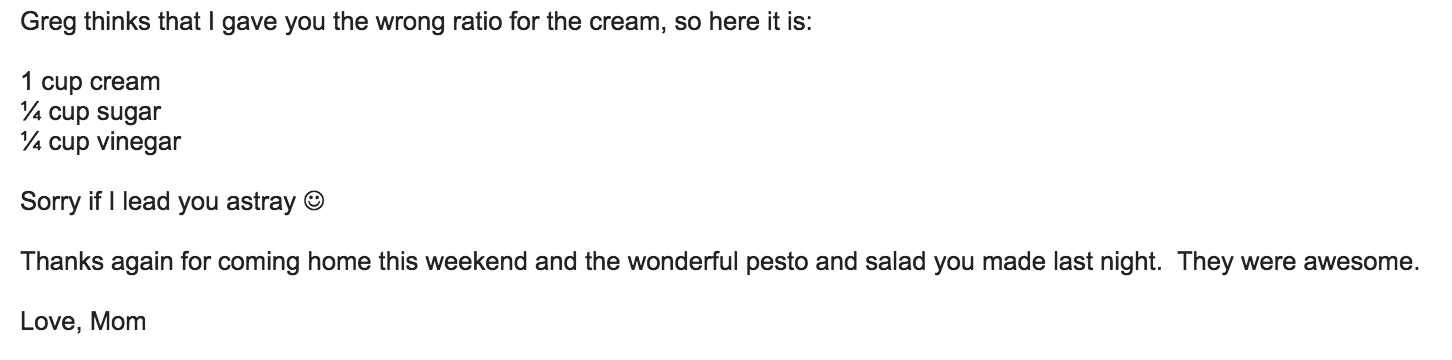
Consider the relationship between a customer’s brand loyalty for CH (
LoyalCH) and what brand of OJ they actuallyPurchase:
From this visualization, develop an approximate rule that can be used to classify a NEW customer as a potential purchaser of CH based on their brand loyalty:
If \(\underline{\hspace{1.5in}}\), then classify as a CH purchaser. Represent this classification rule as a “tree”.
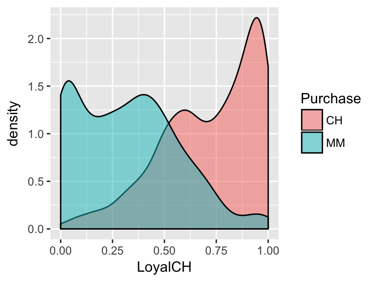
Consider the relationship between the price difference of CH vs MM (
PriceDiff) and what brand of OJ a customer willPurchase:
- Develop an approximate rule that can be used to classify a NEW customer as a potential purchaser of CH based on the price difference alone:
If \(\underline{\hspace{1.5in}}\), then classify as a CH purchaser. - Represent this classification rule as a “tree”.
- Develop an approximate rule that can be used to classify a NEW customer as a potential purchaser of CH based on the price difference alone:
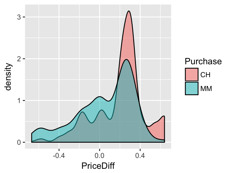
Consider the relationship between a customer’s age and the brand of OJ they
Purchase:
- From this visualization, develop an approximate rule that can be used to classify a NEW customer as a potential purchaser of CH based on their age alone:
If \(\underline{\hspace{1.5in}}\), then classify as a CH purchaser. - Represent this classification rule as a “tree”.
- From this visualization, develop an approximate rule that can be used to classify a NEW customer as a potential purchaser of CH based on their age alone:
- Re-examine the plots above. If you could only use one measure (brand loyalty, price difference, or age) to classify a customer, which would pick? Why?
Luckily we don’t have to pick just 1 measurement. Consider using both and brand loyalty and price difference to classify customers if the relationship between them looked like this:
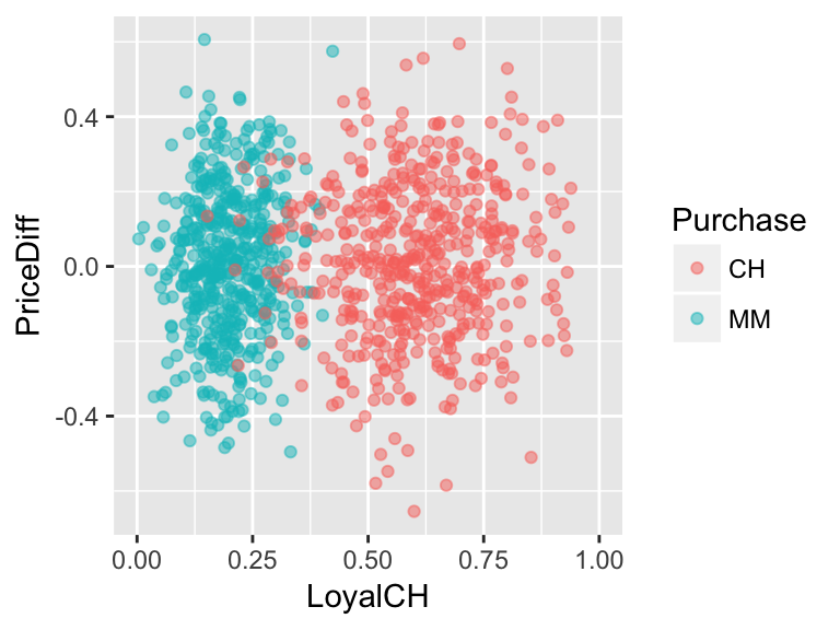
Develop an approximate rule that can be used to classify a new customer based on both their brand loyalty and the price difference:
If \(\underline{\hspace{1.5in}}\), then classify as a CH purchaser. Represent this classification rule as a “tree”. At each branch, you can only split the branch into 2 and can only use one of the measurement variables, ie. predictors.
What if the relationship looked like this?
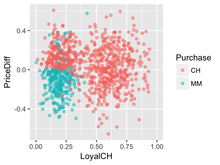
Develop an approximate rule that can be used to classify a new customer based on both their brand loyalty and the price difference:
If \(\underline{\hspace{1.5in}}\), then classify as a CH purchaser. Represent this classification rule as a “tree”. At each branch, you can only split the branch into 2 and can only use one of the measurement variables, ie. predictors.
6.1.2 Practice
Building & Using Classification Trees
We can optimize classification trees using the
tree()function in RStudio.
Make a series of binary splits that terminate in a classification.
At each node identify the binary split which maximizes node purity, ie. creates the biggest discrimination between the classes.
“Splitting continues until the terminal nodes are too small or too few to be split.”
To read the tree: if the condition holds, follow the split to the left. Otherwise, go right.
- Let’s start by classifying customers using the
LoyalCHmeasure alone.- Calculate the average
LoyalCHmeasure for both customers of CH and MM.
- Construct a visualization of the distribution of
LoyalCHmeasures among customers of CH and MM.
Construct a classification tree that classifies
Purchasebehavior byLoyalCH. Store the results astree1. IMPORTANT: There’s some randomness in thetreefunction so be sure to set the random number seed (set.seed). We’ll discuss this as a class.#set the seed set.seed(1) #build the tree (using tree function in tree library) tree1 <- tree(Purchase ~ LoyalCH, OJ) #check out the list of splitting rules tree1 #plot the tree plot(tree1) text(tree1, pretty=0)- Follow-up questions:
- How closely does this tree match your approximate classification rule?
- Use this tree to classify a customer with a CH brand loyalty of 0.4.
Visually superimpose the classification tree rules on your visualization in part a. HINT: It’s not necessary, but if you want to add the classification boundaries to your density plot, you can play around with
geom_vline:geom_vline(xintercept=???)
- How closely does this tree match your approximate classification rule?
- Calculate the average
- Repeat the previous exercise, classifying customer
PurchasebyPriceDiff:- Construct a visualization of the distribution of
PriceDiffamong customers of CH and MM. Based on this visualization, what do you anticipate the classification tree to look like?
Construct a classification tree:
set.seed(2) tree2 <- tree(Purchase ~ PriceDiff, OJ) #check out the list of splitting rules ??? #plot the tree ???- Follow-up questions:
- How closely does this tree match your approximate classification rule?
- Use this tree to classify a customer if there is $0 difference in the price of MM and CH.
- Visually superimpose the classification tree rules on your visualization in part a.
- How closely does this tree match your approximate classification rule?
- Construct a visualization of the distribution of
- Next, classify customer
Purchaseusing bothPriceDiffandLoyalCH:- Construct a visualization of the relationship between
PriceDiffandLoyalCHamong customers of CH and MM. Based on this visualization, what do you anticipate the classification tree to look like?
Construct a classification tree:
set.seed(3) tree3 <- tree(Purchase ~ PriceDiff + LoyalCH, OJ) #check out the list of splitting rules ??? #plot the tree ???- Follow-up questions:
- How closely does this tree match your approximate classification rule?
- Use this tree to classify the purchase of a customer with a CH brand loyalty score of 0.6 if MM is on sale for 25 cents cheaper than CH.
- Use this tree to classify the purchase of a customer with a CH brand loyalty score of 0.8 if MM is on sale for 25 cents cheaper than CH.
Superimpose the classification tree rules on your visualization in part a. HINT: It’s not necessary, but if you want to add the classification boundaries to your scatterplot, you can play around with
geom_segment:geom_segment(aes(x=???, xend=???, y=???, yend=???))
- How closely does this tree match your approximate classification rule?
- Construct a visualization of the relationship between
CLASSIFICATION QUALITY
Reconsider tree3:
#define & summarize
tree3 <- tree(Purchase ~ PriceDiff + LoyalCH, OJ)
summary(tree3)
##
## Classification tree:
## tree(formula = Purchase ~ PriceDiff + LoyalCH, data = OJ)
## Number of terminal nodes:  8
## Residual mean deviance:  0.7583 = 805.3 / 1062
## Misclassification error rate: 0.1636 = 175 / 1070

#plot tree
plot(tree3)
text(tree3, pretty=0)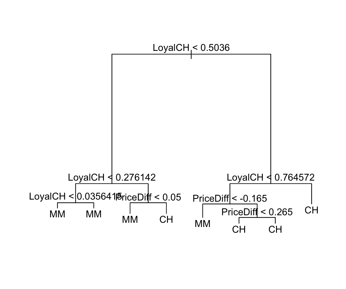
#visualize classification boundaries with data
ggplot(OJ, aes(x=LoyalCH, y=PriceDiff, color=Purchase)) +
    geom_point() +
    geom_segment(aes(x=0.276142, xend=0.276142, y=0.05, yend=0.7), color="black") +
    geom_segment(aes(x=0.5036, xend=0.5036, y=-.165, yend=0.05), color="black") +
    geom_segment(aes(x=0.764572, xend=0.764572, y=-0.7, yend=-.165), color="black") +
    geom_segment(aes(x=0.5036, xend=0.764572, y=-.165, yend=-.165), color="black") +
    geom_segment(aes(x=0.276142, xend=0.5036, y=0.05, yend=0.05), color="black")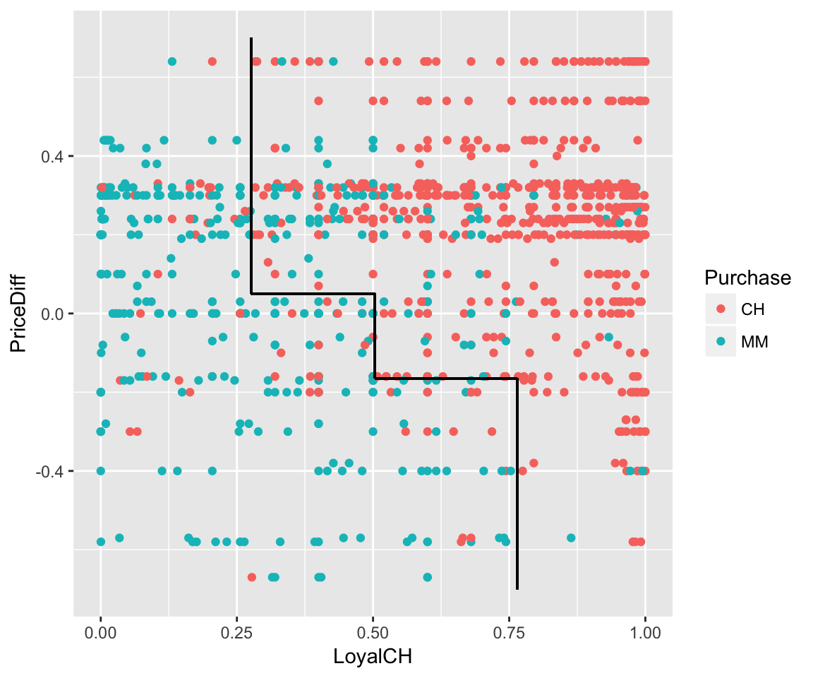
- Note that the classification tree (
tree3) isn’t perfect! It leads to the misclassification of some customers.- What are the 2 types of misclassification? Which type do you think CH employees would rather make?
We can obtain the overall misclassification error rate using the
summary()function:summary(tree3)Revisit each tree and record the misclassification rate in the table below.
Tree Predictor Misclassification error rate tree1LoyalCHtree2PriceDifftree3PriceDiff + LoyalCHThe reported misclassification error rate doesn’t distinguish between false positives and false negatives. To this end, we need some extra syntax. For
tree3:#use the tree to predict/classify the Purchase behavio of each customer in the OJ data tree.pred <- predict(tree3, newdata=OJ, type="class") #record the true Purchase status of each customer trueClass <- OJ$Purchase #tabulate the true and predicted purchases (need caret library) confusionMatrix(tree.pred, trueClass)Carefully examine the
confusionMatrixoutput. Then use this info to report the following misclassification rates:
\[\begin{split} \text{overall misclassification rate} & = \frac{\text{# of misclassified cases}}{\text{total # of cases}} \\ \text{false positive rate} & = \frac{\text{# of CH purchasers misclassified as MM purchasers}}{\text{# of CH purchasers}} \\ \text{false negative rate} & = \frac{\text{# of MM purchasers misclassified as CH purchasers}}{\text{# of MM purchasers}} \\ \end{split}\]Side note: In the
confusionMatrixoutput, you’ll see some classification jargon. TheSensitivityis the true positive rate (1 - false positive rate). TheSpecificityis the true negative rate (1 - false negative rate).
- What are the 2 types of misclassification? Which type do you think CH employees would rather make?
- How do you think we might improve the accuracy of our customer classification? Test your theory and report RStudio output that supports this theory.
6.2 Random Forests
6.2.1 Discussion
NOTE:
You will need the following packages installed and loaded for this activity:
library(dplyr)      #for data wrangling
library(ggplot2)    #for visualizations

library(tree)       #for classification trees
library(caret)      #for confusion matrices
library(randomForest)   #to construct random forests
THE STORY
You, a kangaroo enthusiast, come across a kangaroo skull and wonder whether it’s of the fuliginosus, giganteus, or melanops species:

Luckily, scientists have recorded a bunch of skull measurements. (NOTE: These data are shared through the faraway package.)
#import data
roos <- read.csv("https://www.macalester.edu/~ajohns24/data/roos.csv")

#basics
dim(roos)
## [1] 50 20
head(roos, 3)
##       species    sex basilar.length occipitonasal.length palate.length
## 1 fuliginosus   Male           1745                 1738          1235
## 2 fuliginosus   Male           1619                 1678          1106
## 3 fuliginosus Female           1329                 1375           885
##   palate.width nasal.length nasal.width squamosal.depth lacrymal.width
## 1          304          715         246             237            513
## 2          256          719         253             193            473
## 3          229          549         197             172            396
##   zygomatic.width orbital.width .rostral.width occipital.depth crest.width
## 1            1070           258            328             744         149
## 2             946           242            276             689         119
## 3             838           214            239             587         153
##   foramina.length mandible.length mandible.width mandible.depth
## 1              96            1502            167            239
## 2              94            1369            159            215
## 3              79            1103            133            182
##   ramus.height
## 1          853
## 2          765
## 3          666

#a species table
table(roos$species)
##
## fuliginosus   giganteus    melanops
##          17          17          16
BIG TREES
We’ll fill in the following table as you complete this section:
| Tree | Predictors | Training misclassification | Testing misclassification |
|---|---|---|---|
rooTree1 |
nasal.length |
||
rooTree2 |
nasal.length & basilar.length |
||
rooTree3 |
all except sex (18 predictors) |
Check out the
nasal.lengthmeasurements among the 3 species:ggplot(roos, aes(x=nasal.length, fill=species)) + geom_density(alpha=0.5)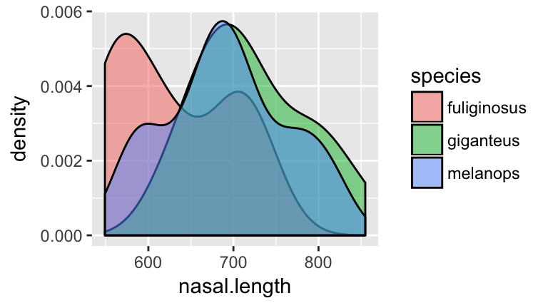
- Before moving on, anticipate what a classification tree of
speciesbynasal.lengthmight look like!
Check your intuition. Construct the classification tree and record the overall misclassification rate in the “Training misclassification” column of the table above:
set.seed(1)
rooTree1 <- tree(species ~ nasal.length, roos)
summary(rooTree1)
plot(rooTree1)
text(rooTree1, pretty=0)
- Before moving on, anticipate what a classification tree of
Next, consider the relationship of
nasal.lengthandbasilar.lengthamong the 3 species:ggplot(roos, aes(x=nasal.length, y=basilar.length, color=species)) + geom_point()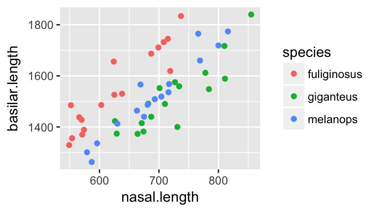
- Before moving on, anticipate what a classification tree of
speciesbynasal.lengthandbasilar.lengthmight look like.
- Tap into your intuition: how do you think the misclassification rate of the new tree will compare to that which used
nasal.lengthalone? (Will it be bigger/smaller/the same?)
Check your intuition. Construct the classification tree and record the overall misclassification rate in the “Training misclassification” column of the table above:
set.seed(2)
rooTree2 <- tree(species ~ nasal.length + basilar.length, roos)
summary(rooTree2)
plot(rooTree2)
text(rooTree2, pretty=0)
- Before moving on, anticipate what a classification tree of
Let’s be greedy! We’ve seen that we can improve classification by including more predictors. With this in mind, let’s use every possible predictor except
sex. (Remember: all we’ve found is the kangaroo skull!) Note: Check out the shortcut syntaxspecies ~ . - sexwhich tells RStudio to use every predictor butsex.set.seed(3) rooTree3 <- tree(species ~ . - sex, roos) summary(rooTree3) plot(rooTree3) text(rooTree3, pretty=0)Record the misclassification rate in the “Training misclassification” column of the table above. Was your intuition about the misclassification rate correct?
- Not so fast. Do you anticipate any problems with the greedy “keep adding variables to the tree approach”? For example, suppose a new skull specimen comes in. Which tree do you think will provide the most accurate classifications of new skulls?
Surprise! Another kangaroo researcher collected a different sample of 50 kangaroos:
roosNew <- read.csv("https://www.macalester.edu/~ajohns24/data/roosNew.csv") dim(roosNew) ## [1] 50 20- We can use our trees (
rooTree1,rooTree2,rooTree3) to classify these 50 new specimens. Which tree do you think will do the best job. Why?
Use
rooTree1to classify the 50 new specimens. Record the overall misclassification rate in the “Testing misclassification” column of the table above. NOTE: be sure to pause and think about the syntax.#record the true species of the new specimens trueClass <- roosNew$species #use rooTree1 to classify the new speciments new.pred1 <- predict(rooTree1, newdata=roosNew, type="class") #get the confusion matrix confusionMatrix(new.pred1, trueClass)Repeat part b for
rooTree2androoTree3.- Examine the table that summarizes the “Training misclassification” and “Testing misclassification” for the 3 classification trees. Summarize your conclusions. Mainly, what do these results caution about the following two practices:
- using the same data that’s used to build the tree to also measure the classification accuracy of this tree; and
- including more and more and more predictors in the classification tree.
- using the same data that’s used to build the tree to also measure the classification accuracy of this tree; and
- We can use our trees (
Training vs Test Sets
The data used to build/train a model is called training data. The data used to test the accuracy of this model is called testing data. In practice, we have just one sample of data. No problem - we can randomly divide this sample into two sets, using one for training and the other for testing. Side note: cross validation is the process of repeating this division multiple times and averaging the results.
- THINK: We’ve seen that trees built from our sample are optimized for this sample - they might not perform as well when applied to new data. How can we use the concept of training vs test sets to improve our classifier?
6.2.2 Practice
RESAMPLES
Forget about the roosNew for now and focus on our original roos sample. We’ve seen that trees built from our sample are optimized for this sample - they might not perform as well when applied to new data. To prevent the overfitting of a tree to our sample of data, we can construct multiple trees and average the results. Let’s start with just three trees.
- Constructing multiple trees requires resampling from our original sample.
To this end, try out the
sample_nfunction (from thedplyrpackage) on a small samplesmall.small <- data.frame(x=c(1:6)) small #resample from x 6 times WITH replacement sample_n(small, size=6, replace=TRUE)Run the
sample_n()function a few times. Notice that the resamples change and that some cases appear multiple times within each resample (since we’re sampling with replacement).Though we want random resamples, we also want to be able to reproduce our results. We can achieve this using
set.seedto set the random number generating seed. Try this code a few times (all lines) and notice that you get the same resample every time!#set the seed set.seed(2000) #resample from x 6 times WITH replacement sample_n(small, size=6, replace=TRUE)
Take 3 different resamples from
roos:#set the seed set.seed(1990) samp1 <- sample_n(roos, size=50, replace=TRUE) samp2 <- sample_n(roos, size=50, replace=TRUE) samp3 <- sample_n(roos, size=50, replace=TRUE)From each resample, construct a classification tree of
speciesby all predictors (exceptsex):set.seed(4) treeSamp1 <- tree(species ~ . - sex, samp1) treeSamp2 <- tree(species ~ . - sex, samp2) treeSamp3 <- tree(species ~ . - sex, samp3)- Plot the 3 trees. Describe the differences among them.
Use each tree to classify the first specimen in
roos(roos[1,]). In light of these 3 predictions, how would you classify this kangaroo?predict(treeSamp1, newdata=roos[1,], type="class") predict(treeSamp2, newdata=roos[1,], type="class") predict(treeSamp3, newdata=roos[1,], type="class")Use each tree to classify the second specimen in
roos(roos[2,]). In light of these 3 predictions, how would you classify this kangaroo?predict(treeSamp1, newdata=roos[2,], type="class") predict(treeSamp2, newdata=roos[2,], type="class") predict(treeSamp3, newdata=roos[2,], type="class")
- Plot the 3 trees. Describe the differences among them.
RANDOM FORESTS
The exercise above is a baby version of a random forest. Let’s distinguish this from the foundational classification tree.
Classification trees use one sample to build one tree and then use this tree to classify new cases:

Random forests take multiple (eg: 500) resamples from the original sample, build a unique tree from each resample, use each tree to classify new cases, and use the “majority vote” to provide a final classification:
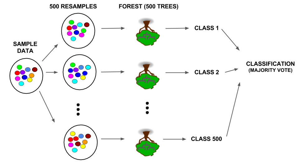
Details: Not only is there randomness in the resamples used to build each tree, only a random sample of predictors is considered at each split. If there are \(p\) predictors, roughly \(\sqrt{p}\) are considered at each split. When all \(p\) are used, it’s called bagging.
Let’s construct a random forest in the
randomForestRStudio package:Note that#set the seed set.seed(3) #construct the forest forest1 <- randomForest(species ~ . -sex, roos)forest1contains 500 trees. We can’t plot 500 trees. Rather, we’ll use them to make majority vote classifications.Check out the confusion matrix of
forest1applied toroos. Calculate and report the overall misclassification rate.forest1Use the random forest to classify the 50 new cases in
roosNew. Construct a confusion matrix and report the overall misclassification rate.#test on new data forestPred1 <- predict(forest1, newdata=roosNew, type="class") #construct the confusion matrix trueClass <- roosNew$species confusionMatrix(forestPred1, trueClass)Compare the misclassification rate of the random forest that uses all predictors (
forest1) to the misclassification rate of the classification tree that uses all predictors (tree3). Which method produces more accurate classifications?
6.3 Regression Trees
6.3.1 Discussion
If you shop, listen to music, or watch videos online, you’re well familiar with the recommendations that pop up:


These recommendations are built from information about you and other customers: age, sex, past purchasing/viewing behavior, etc. In this activity, we’ll take a simple peak into movie recommendations using the data collected and shared by the GroupLens research team at the University of Minnesota. You can access a version of this data compiled by Danny Kaplan for the Data Computing book:
STEP 1:
Only the first time you use the data, downloadMovieLens.rdato your own computer:download.file("http://tiny.cc/dcf/MovieLens.rda", destfile = "MovieLens.rda")STEP 2:
Now that the data are downloaded, you can access it by loading the data:load("~/MovieLens.rda")
MovieLens.rda contains 3 separate data tables:
Movies= information about the collection of rated movies (eg: title, genre)Users= information about the users that rate movies
Ratings= the movie ratings
6.3.2 Practice
GETTING STARTED
First, load the ggplot2 and dplyr libraries:
library(ggplot2)
library(dplyr)
Before doing any analysis, let’s get to know the basic structure of these data.
- Check out the
Moviesdata set.- How many different movie titles are there?
- Order the rows from the oldest to the newest. Then specify: What’s the oldest movie? The newest?
- Construct a visualization of the percentage of movies within each year that are Westerns.
- How many different movie titles are there?
- Check out the
Usersdata set.- How many users / movie raters are there?
- What percentage of raters are male? Female?
- What’s the average age of the male raters? The female raters?
- How many users / movie raters are there?
- Check out the
Ratingsdata set.- How many movie ratings are there?
- What’s the title of the most reviewed movie? (Hint: to find the title you’ll need to also use the
Moviesdata!)
- What’s the most reviews by a single user?
- How many movie ratings are there?
Finally, we want to join
UsersandMoviesinformation with theirRatings. To this end, join the 3 data sets and name itMergedMovies. Confirm that your joined data set has the properties below:dim(MergedMovies) ## [1] 100000 30 head(MergedMovies, 1) ## user_id movie_id rating time_stamp age sex occupation zip_code ## 1 196 242 3 1997-12-04 15:55:49 49 M writer 55105 ## movie_title release_date ## 1 Kolya (1996) 1997-01-24 ## IMDb_URL unknown Action Adventure ## 1 http://us.imdb.com/M/title-exact?Kolya%20(1996) FALSE FALSE FALSE ## Animation Children's Comedy Crime Documentary Drama Fantasy Film-Noir ## 1 FALSE FALSE TRUE FALSE FALSE FALSE FALSE FALSE ## Horror Musical Mystery Romance Sci-Fi Thriller War Western ## 1 FALSE FALSE FALSE FALSE FALSE FALSE FALSE FALSE
PREDICTING RATINGS
Our ultimate goal is to recommend new movies to our users. To this end, we can predict their rating of a given movie based on past movie preferences. Though rating is a quantitative variable, we can use the same tree approach that we used in previous activities to classify categorical outcomes. To keep it simple we’ll focus on a single movie, “The First Wives Club” (1996). A quick synopsis: three women band together to take revenge on their ex-husbands and their exes’ new wives.

- First, we need to construct a data table that will help us with the task at hand.
- Obtain a subset of
MergedMoviesthat contains only ratings for “The First Wives Club” (movie_id476). Name thisFWC.
- With the original
MergedMovies, calculate each users’ average (mean) rating for romantic movies. Name thisRom.
- Join
FWCandRominto a single data table namedFWC.
Make sex a factor variable (instead of character).
FWC <- FWC %>%
    mutate(sex=as.factor(sex))
Finally, confirm that your results match those below:
dim(FWC) ## [1] 160 31 head(FWC, 1) ## user_id movie_id rating time_stamp age sex occupation zip_code ## 1 207 476 2 1998-01-09 22:52:23 39 M marketing 92037 ## movie_title release_date ## 1 First Wives Club, The (1996) 1996-09-14 ## IMDb_URL ## 1 http://us.imdb.com/M/title-exact?First%20Wives%20Club,%20The%20(1996) ## unknown Action Adventure Animation Children's Comedy Crime Documentary ## 1 FALSE FALSE FALSE FALSE FALSE TRUE FALSE FALSE ## Drama Fantasy Film-Noir Horror Musical Mystery Romance Sci-Fi Thriller ## 1 FALSE FALSE FALSE FALSE FALSE FALSE FALSE FALSE FALSE ## War Western avgRomance ## 1 FALSE FALSE 3.137255 class(FWC$sex) ## [1] "factor" - Obtain a subset of
In past activities we’ve seen that training (building) and testing the accuracy of a predictive algorithm on the same data can provide overly optimistic estimates of the algorithm’s accuracy. With this in mind, we’ll split our sample data into 2 pieces. Of the 160 cases in
FWC, we’ll set aside 32 cases (20%) for testing and use the other 128 cases for training. Be sure to set the random number generating seed to 15 and pick through the syntax:#set the seed set.seed(15) #sample 32 cases for testing FWCTest <- sample_n(FWC, size=32) #identify the cases in FWC that are NOT the test cases #store these for training #specify the use of setdiff in the dplyr package FWCTrain <- dplyr::setdiff(FWC, FWCTest) #check the dimensions dim(FWCTest) ## [1] 32 31 dim(FWCTrain) ## [1] 128 31
- To build up our understanding of regression trees, let’s start with a simple investigation of the relationship between
ratingandsex.- Construct and comment on a visualization of the relationship between these 2 variables.
Using the training data (
FWCTrain), construct and visualize a regression tree ofratingbysex:library(tree) set.seed(0) tree0 <- tree(rating ~ sex, FWCTrain) plot(tree0) text(tree0, pretty=0)- Whereas the output of a classification tree is a class/category prediction, the output of a regression tree is a quantitative prediction. With this in mind, use the regression tree to predict “The First Wives Club” rating for the following users:
- a male
- a female
NOTE: these predictions should align with the trend you observed in the plot in part a.
- a male
- Construct and comment on a visualization of the relationship between these 2 variables.
- The regression tree above ignores other information we have on users. Consider predicting
ratingfrom bothageandsex.Construct a visualization of the relationship between these three variables. Incorporate a
geom_smooththat highlights the trend in this relationship. NOTE: Be sure to jitter the data to reveal overlapping cases.After examining the visualization, describe the relationship between
rating,ageandsex.
- Now that we have an understanding for the relationship between these variables, let’s develop a regression tree.
Construct a regression tree for predicting
ratingfromageandsex.set.seed(1) tree1 <- tree(rating ~ age + sex, FWCTrain) plot(tree1) text(tree1, pretty=0)- Use the tree to predict “The First Wives Club” rating for the following users:
- a 30 year old female
- a 30 year old male
- a 60 year old female
- a 60 year old male
- a 30 year old female
How many possible predictions does the tree produce? NOTE: Thus the tree segments all users into this number of categories based on their
ageandsex!In part b we used the tree to predict ratings for 4 specific users based on their
ageandsex. To visualize what these predictions look like across the entire range of the variables, we can use the tree to predict the rating for each user inFWCTrainand superimpose these predictions onto a plot ofratingbyageandsex. (NOTE: We are simply visualizing, not evaluating the quality of, these models thus can use the training data.) Carefully examine the syntax as you use it!#use tree1 to predict ratings for all users in FWCTrain pred <- predict(tree1, FWCTrain) #store these predictions as "treepred1" in FWCTrain FWCTrain <- FWCTrain %>% mutate(treepred1=pred) #superimpose a line plot of these predictions on the data ggplot(FWCTrain, aes(y=treepred1, x=age, color=sex)) + geom_line() + geom_jitter(aes(y=rating, x=age, color=sex), alpha=0.5)
- As we’ve seen in past activities, trees tend to “overfit” predictions to the sample data used to build the tree. Instead, we can use random forests which take multiple (eg: 500) resamples, construct a tree using each resample, and average the results.
Construct a random forest for predicting
ratingfromageandsex. Since there’s randomness in the resampling, be sure to first set the seed.library(randomForest) set.seed(2000) forest1 <- randomForest(rating ~ sex + age, FWCTrain)REMEMBER: There are 500 trees in the random forest. We don’t plot these.
As you did for the tree predictions in the previous exercise, superimpose the random forest predictions onto a plot of
ratingbyageandsex. Carefully examine the syntax as you use it!#use tree1 to predict ratings for all users in FWCTrain pred <- predict(forest1, FWCTrain) #store these predictions as "forestpred1" in FWCTrain FWCTrain <- FWCTrain %>% mutate(forestpred1=pred) #superimpose a line plot of these predictions on the data ggplot(FWCTrain, aes(y=forestpred1, x=age, color=sex)) + geom_line() + geom_jitter(aes(y=rating, x=age, color=sex), alpha=0.5)Compare the random forest to the regression tree. What does the forest achieve that the tree did not?
- We’ve now seen that the regression tree is more rigid than the random forest. However, we need a more rigorous measurement of the prediction accuracy of these three methods. To this end, we can compare the accuracy of the tree and forest predictions of the ratings for the cases in the test set (
FWCTest).The true ratings of the test cases are stored in
FWCTest$rating. Create a data table that stores these alongside theageandsexof these cases as well as the predicted ratings for these cases calculated from both methods:#calculate the tree & forest predictions treetest1 <- predict(tree1, FWCTest) foresttest1 <- predict(forest1, FWCTest) #store these with the test data TestResults <- FWCTest %>% dplyr::select(c(age, sex, rating)) %>% mutate(treetest1, foresttest1)Examine the results for the first test case:
head(TestResults, 1)
##   age sex rating treetest1 foresttest1
## 1  24   M      3  3.363636    2.826947
Calculate the prediction error for both methods. That is, calculate the difference between the user’s true rating (
3) and their predicted rating. Which method produced the best prediction for this case? The worst?Let’s add the prediction errors (the difference between the
ratingand predictions) to theTestResultsdata table:TestResults <- TestResults %>% mutate(treeError1=???, forestError1=???)NOTE: The calculations for the first user should match those from part b!
We now have a measure of the prediction error of each method for each case. We can obtain an overall measure of prediction error for each method by calculating the mean absolute prediction error, ie. the mean of the absolute values of prediction errors. Calculate and compare the mean absolute prediction error for the tree and forest. Which method produced the most accurate predictions for the test cases? The least accurate? NOTE: Taking the absolute values of the prediction errors prevents the under- and over-predictions from canceling each other out!
#Try the abs function first
abs(-2)
abs(2)

mean(abs(TestResults$treeError1))
mean(abs(TestResults$forestError1))
MORE PREDICTORS!
At the beginning of this activity, we calculated the users’ average ratings for films in the “Romance” genre. Let’s incorporate this into our model.
Using the training data, let’s construct the tree and forest all in one go:
tree2 <- tree(rating ~ age + sex + avgRomance, FWCTrain)
#set the seed for the forest!
set.seed(700)
forest2 <- randomForest(rating ~ sex + age + avgRomance, FWCTrain)
Similar to Exercises 10 & 11, we can use both the regression tree and random forest to predict ratings for any given user based on their
age,avgRomanceandsex. To visualize what these predictions look like across the entire range of the variables, we can use the tree and forest to predict the rating for each user inFWCTrainand superimpose these predictions onto a plot ofratingbyage,avgRomance, andsex. (NOTE: We are simply visualizing, not evaluating the quality of, these models thus can use the training data.)First, use both methods to construct predictions of the
FWCTraincases and store these inFWCTrain:FWCTrain <- FWCTrain %>% mutate(treepred2=???, forestpred2=???)Visualize each methods’ predictions versus
age,avgRomanceandsex.ggplot(FWCTrain, aes(y=age, x=avgRomance, color=as.factor(treepred2))) + geom_point() + facet_wrap(~ sex) ggplot(FWCTrain, aes(y=age, x=avgRomance, color=forestpred2)) + geom_point() + facet_wrap(~ sex)Comment on the visualizations. What can you learn from them? For example, you should notice ~12 different colors in the visualization of the tree predictions. To what 12 groups do these correspond?
- Let’s examine the accuracy of the ratings predictions using these two methods.
Using the test cases, calculate and report the mean absolute prediction error for the tree and forest (
tree2,forest2).Which method minimizes the prediction error?
Compare the prediction errors of (
tree2,forest2) to those of (tree1,forest1). What does this tell us about the usefulness of incorporatingavgRomanceinto our predictions?