3 Activities: Visualization
3.1 Introduction to Data Visualization
3.1.1 Motivation
Check out this excerpt from the (2017) Wiki page on Global warming:
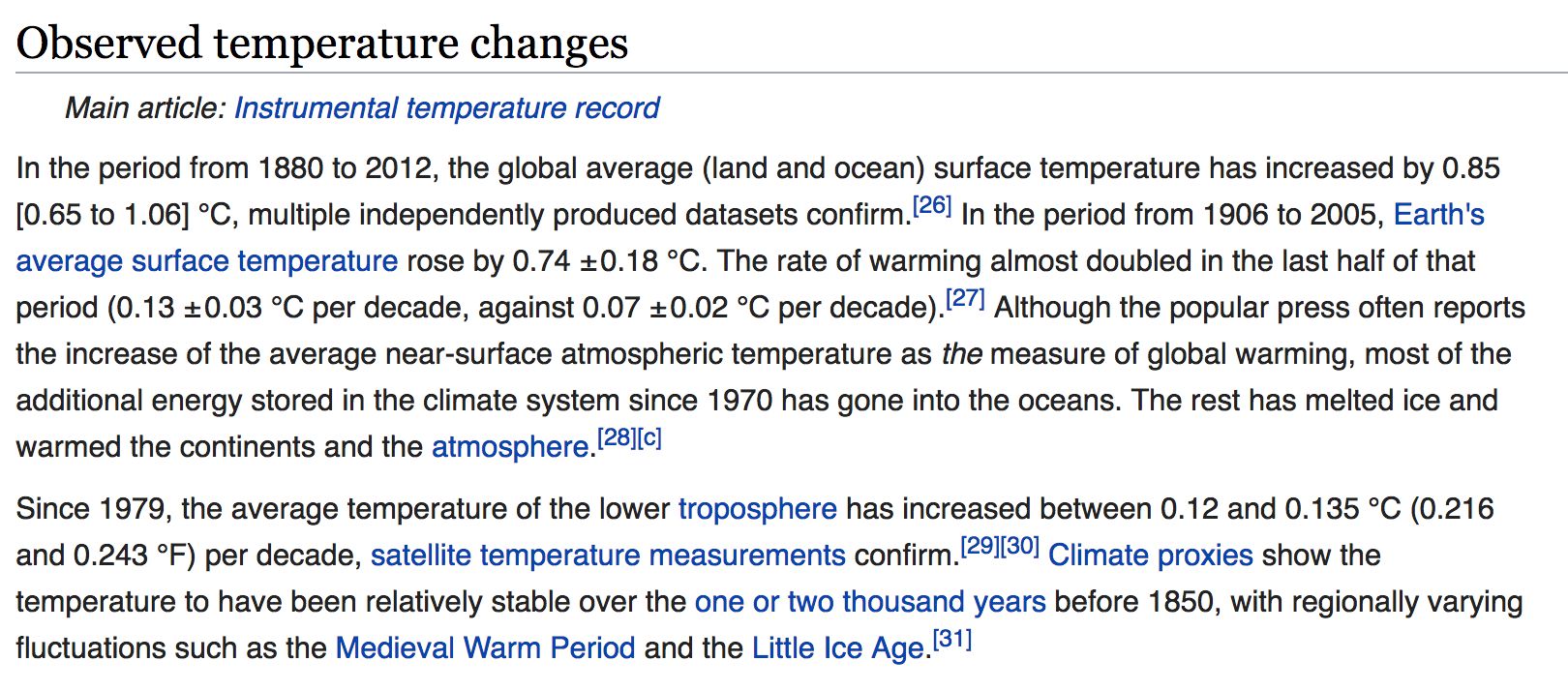
Or this excerpt of temperature data from NOAA

The Wiki text and NOAA table both provide us with data on global warming. Yet visualizations would make these excerpts even more powerful! Why?
- Visualizations help us understand what we’re working with: What are the scales of our variables? Are there any outliers, i.e. unusual cases? What are the patterns among our variables?
- This understanding will inform our next steps: What method of analysis / model is appropriate?
- Once our analysis is complete, visualizations are a powerful way to communicate our findings and tell a story.
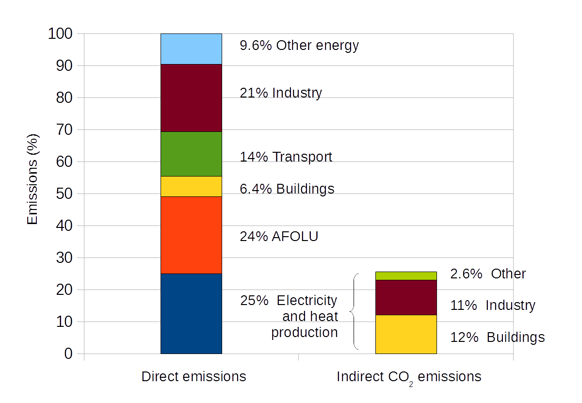
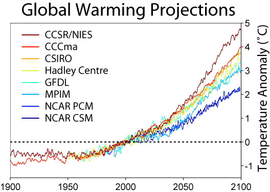
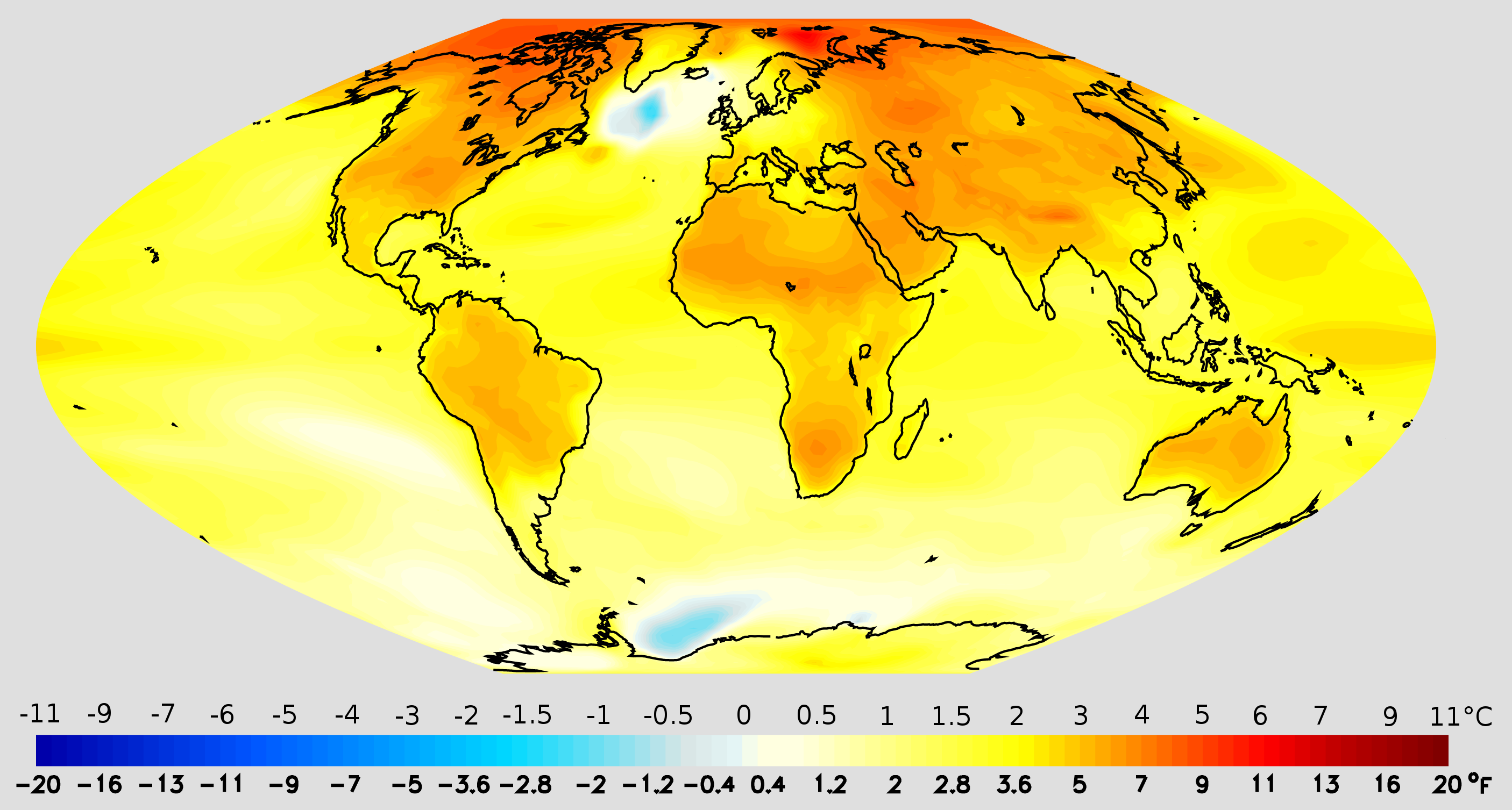
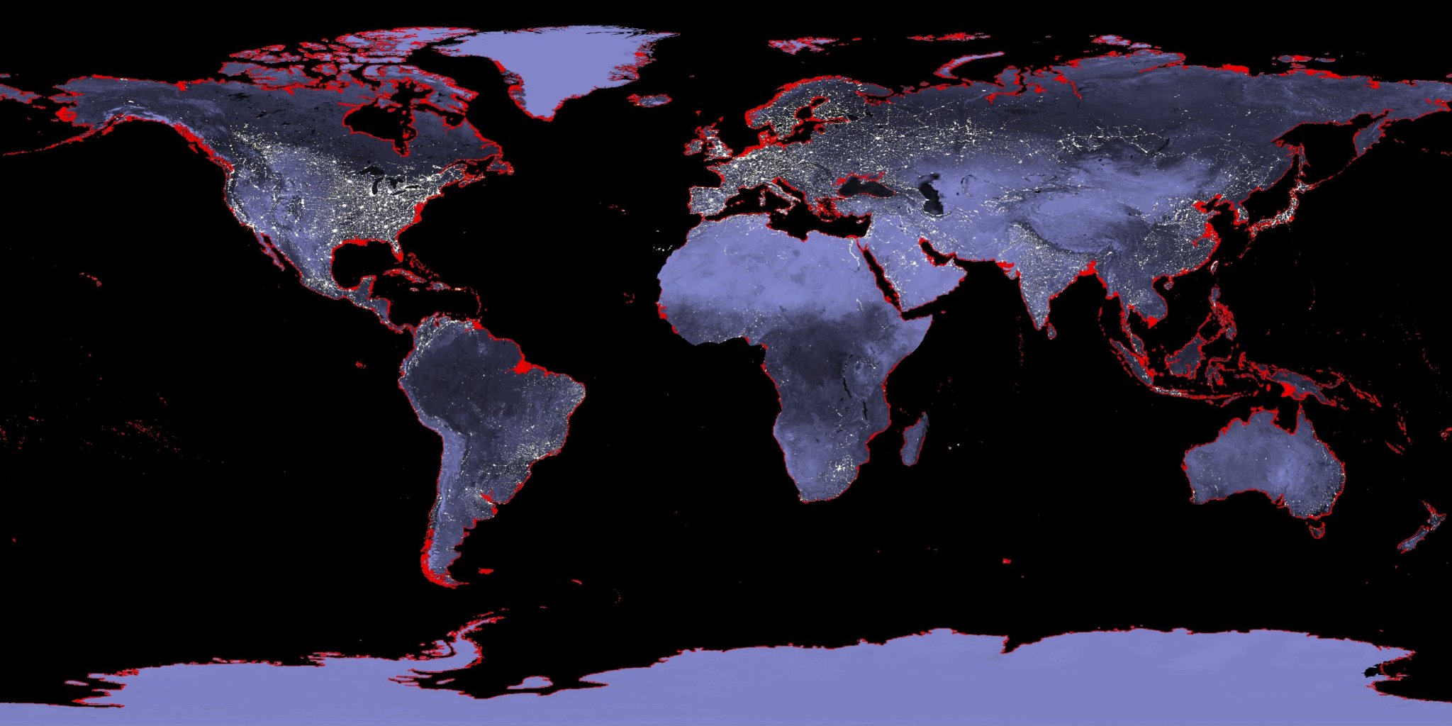
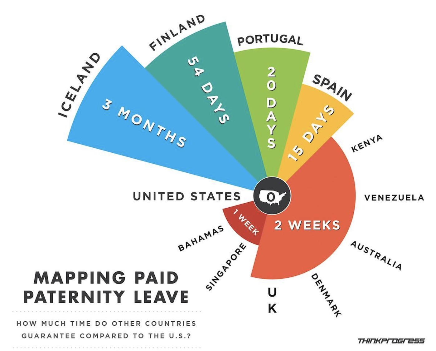
Consider a bunch of different visualizations from the Wiki page (some more successful than others):


Beyond the traditional visualization of climate change:
https://www.beforetheflood.com/explore/the-crisis/sea-level-rise/
http://www.nspkphasechange.com/ & http://www.futures-north.com/projects/phase-change/
More Examples
FlowingData: blog, Best visualizations of 2016, One dataset visualized 25 ways
3.1.2 Features of Good (& Bad) Visualizations
As the “One dataset visualized 25 ways” example demonstrates, there’s not one right way to visualize a dataset. However, there are guiding principles that distinguish between “good” and “bad” graphics. It’s easy to be a critic, so let’s start with some bad visualizations. For each visualization below, identify areas for improvement. (NOTE: You can find more examples of bad viz at WTF Visualizations.)


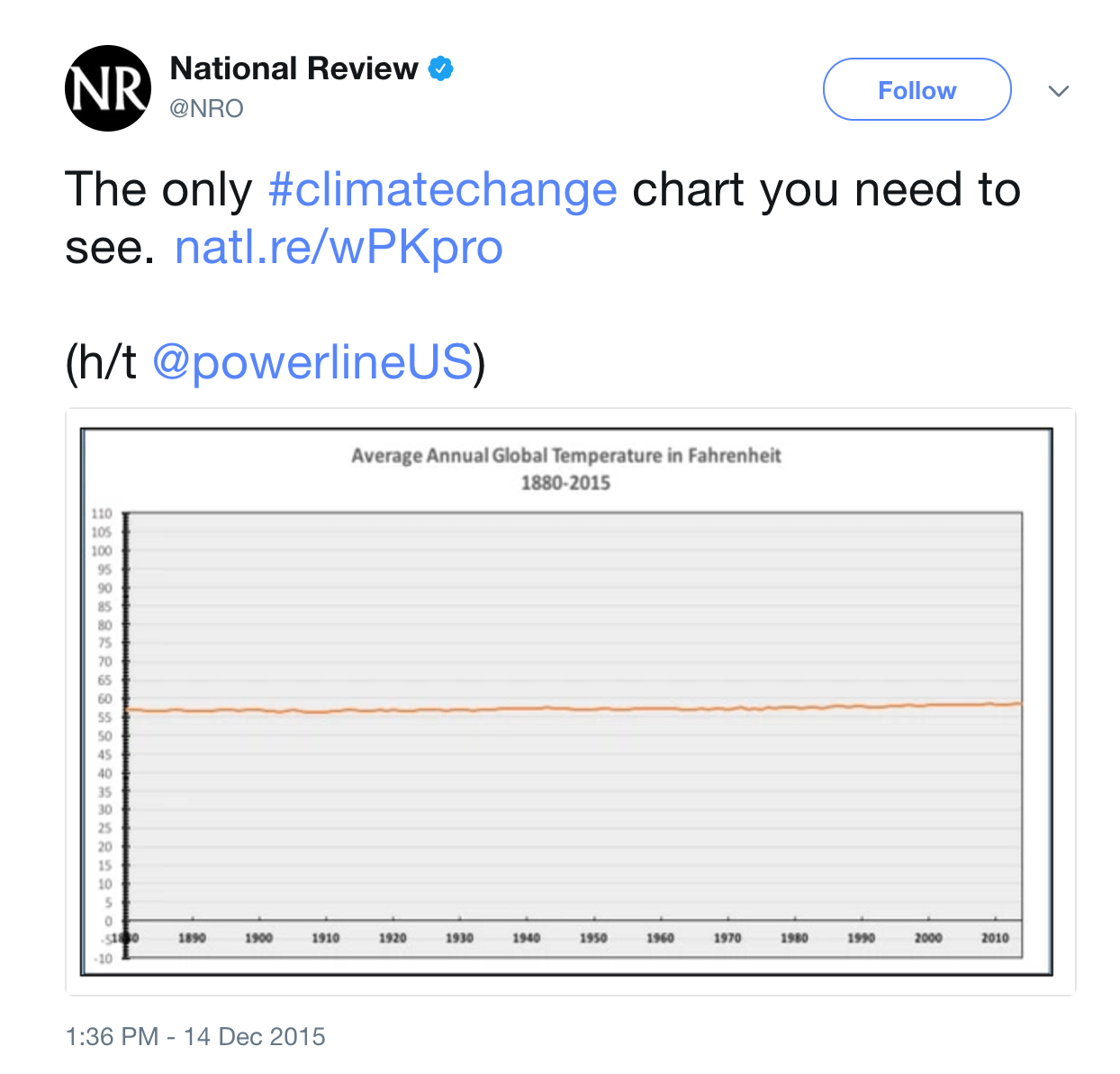
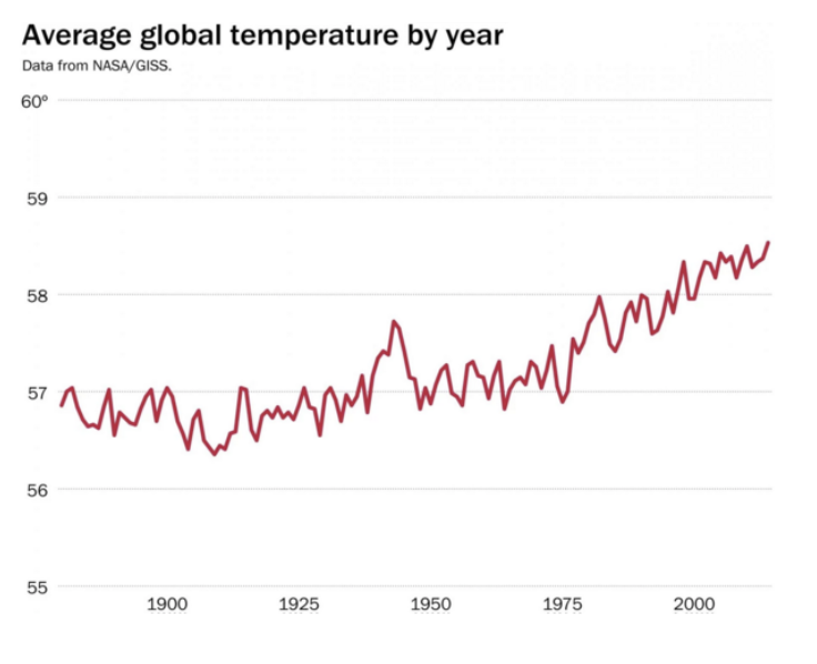
A better plot of changes in global temperature:
Properties of Effective Visualizations
Content
Display meaningful information.Design
Minimize ambiguity: provide scales, label axes, etc
Eliminate “chart junk” (distracting & unnecessary adornments)Ethics
Do not present the data in a way that misleads the audience.
With this in mind let’s examine what Edward Tufte, a noted data viz expert, considers to be “probably the best statistical graphic ever drawn”. Drawn by Charles Minard, you can even buy a print for your dorm wall):

3.1.3 Grammar of Graphics
In this course we’ll largely construct visualizations using the ggplot function in RStudio. NOTE: gg is short for “grammar of graphics”. Though the ggplot learning curve can be steep, its grammar is intuitive and generalizable once mastered. Let’s explore the concepts behind this grammar before diving into the syntax.
The following plots represent the different components of graphics in general & ggplot in particular:
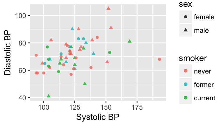
Figure 3.1: Blood pressure readings from a random subset of the NHANES data set.
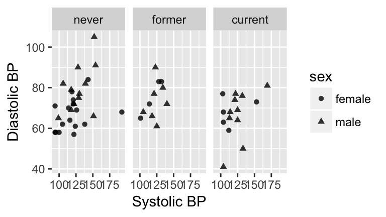
Figure 3.1: Blood pressure readings from a random subset of the NHANES data set.
Components of a graphic
- frames
The position scale describing how data are mapped to the x and y axes.
- glyphs
The basic graphical unit that represents a piece of information. Other terms used include mark and symbol. In its original sense, in archeology, a glyph is a carved symbol. For example, a heiroglyph:
A data glyph is also a mark that encodes the value of a variable or relationship among variables:


- aesthetic
a visual property of a glyph such as position, size, shape, color, etc.
may be mapped based on data values:smoker -> color
may be set to particular non-data related values:color is black
- facet
a subplot that separates a single graph into multiple graphs, one per subset of the data
- scale
a mapping that translates data values into aesthetics.
example: never-> pink; former-> aqua; current-> green
- guide
An indication for the human viewer of the scale. This allows the viewer to translate aesthetics back into data values.
examples: x- and y-axes, various sorts of legends


EXERCISE: Eye Training for the Layered Grammar of Graphics
For your assigned graphic, discuss the following seven questions with your group:
Frame
What variables constitute the frame?Glyphs
What glyphs are used?- Aesthetics
- What are the aesthetics for those glyphs?
- Which variable is mapped to each aesthetic?
- What are the aesthetics for those glyphs?
- Facets
- Are facets used?
- If so, which variable is used for faceting?
- Are facets used?
Scales & Guides
Which scales are displayed with a guide?Data
What raw data would be required for this plot, and what form should it be in?
Here are the graphics examples, all taken from the New York Times website:
- Admissions gap
- Medicare hospital charges
- Housing prices
- Baseball pitching
- Phillips curve
- School mathematics ratings
- Corporate taxes
3.2 Univariate Visualizations
3.2.1 Practice
Data Visualization Workflow + ggplot
There’s no end to the number and type of visualizations you could make. Thus the process can feel overwhelming. FlowingData has some good recommendations for data viz workflow:
Ask the data questions.
Simple research questions will guide the types of visualizations that you should construct.Start with the basics and work incrementally.
Before constructing complicated or multivariate or interactive graphics, start with simple visualizations. An understanding of the simple patterns provides a foundation upon which to build more advanced analyses & visualizations.Focus
Reporting a large number of visualizations can overwhelm the audience & obscure your conclusions. Instead, pick out a focused yet comprehensive set of visualizations.
In this course we’ll largely construct visualizations using the ggplot function in RStudio. Though the ggplot learning curve can be steep, its “grammar” is intuitive and generalizable once mastered. The ggplot plotting function is stored in the ggplot2 package:
library(ggplot2)The best way to learn about ggplot is to just play around. Don’t worry about memorizing the syntax. Rather, focus on the patterns and potential of their application. Here’s a link to a helpful cheat sheet:
Getting Started
The “Bechdel test”, named after cartoonist Alison Bechdel, tests whether movies meet the following criteria:
- there are \(\ge\) 2 (named) female characters;
- these women talk to each other…
- about something other than a man
In the fivethirtyeight.com article “The Dollar-And-Cents Case Against Hollywood’s Exclusion of Women”, the authors analyze which Hollywood movies do/don’t pass the test. Their data are available in the fivethirtyeight package:
library(fivethirtyeight)
data(bechdel)
head(bechdel)| year | imdb | title | clean_test | binary | budget_2013 | domgross_2013 | intgross_2013 |
|---|---|---|---|---|---|---|---|
| 2013 | tt1711425 | 21 & Over | notalk | FAIL | 13000000 | 25682380 | 42195766 |
| 2012 | tt1343727 | Dredd 3D | ok | PASS | 45658735 | 13611086 | 41467257 |
| 2013 | tt2024544 | 12 Years a Slave | notalk | FAIL | 20000000 | 53107035 | 158607035 |
| 2013 | tt1272878 | 2 Guns | notalk | FAIL | 61000000 | 75612460 | 132493015 |
| 2013 | tt0453562 | 42 | men | FAIL | 40000000 | 95020213 | 95020213 |
| 2013 | tt1335975 | 47 Ronin | men | FAIL | 225000000 | 38362475 | 145803842 |
- Before diving into any visualizations of these data, we first must understand its structure and contents.
- What are the units of observation and how many units are in this sample?
- What are the levels of the
clean_testandbinaryvariables?
- Check out the codebook for
bechdel. What’s the difference betweendomgross_2013anddomgross?
- What are the units of observation and how many units are in this sample?
- We’ll consider univariate visualizations of the
clean_testandbudget_2013variables.- What features would we like a visualization of the categorical
clean_testvariable to capture?
- What features would we like a visualization of the quantitative
budget_2013variable to capture?
- What features would we like a visualization of the categorical
CATEGORICAL UNIVARIATE VISUALIZATIONS
Research Question:
Among the movies in our sample, what fraction pass the Bechdel test? Among those that fail the test, in which way do they fail (eg: there are no women, there are women but they only talk about men, etc)?
To answer the above research question, we can explore the categorical
clean_testvariable. A table provides a simple summary of the number of movies that fall into eachclean_testcategory:table(bechdel$clean_test)
A bar chart provides a visualization of this table. In examining the bar chart, keep your eyes on the following.
Visualizing Categorical Variables
In examining plots of a categorical variable, take note of the following features:
- variability
Are cases evenly spread out among the categories or are some categories more common than others?
- contextual implications
In the context of your research, what do you learn from the bar chart? How would you describe your findings to a broad audience?
Try out the code below that builds up from a simple to a customized bar chart. At each step determine how each piece of code contributes to the plot.
#plot 1: set up a plotting frame (a blank canvas)
ggplot(bechdel, aes(x=clean_test))

#plot 2: what changed / how did we change it?
ggplot(bechdel, aes(x=clean_test)) +
    geom_bar()

#plot 3: what changed / how did we change it?
ggplot(bechdel, aes(x=clean_test)) +
    geom_bar() +
    labs(x="Outcome of Bechdel Test", y="Number of movies")

#plot 4: what changed / how did we change it?
ggplot(bechdel, aes(x=clean_test)) +
    geom_bar(color="purple") +
    labs(x="Outcome of Bechdel Test", y="Number of movies")

#plot 5: what changed / how did we change it?
ggplot(bechdel, aes(x=clean_test)) +
    geom_bar(fill="purple") +
    labs(x="Outcome of Bechdel Test", y="Number of movies")
- Summarize the visualization: what did you learn about the “distribution” of the
clean_testvariable?
QUANTITATIVE UNIVARIATE VISUALIZATIONS
Research Question:
Among the movies in our sample, what’s the range of budgets? What’s the typical budget? The largest/smallest?
We can answer the above research question by exploring the quantitative budget_2013 variable. Quantitative variables require different summary tools than categorical variables. We’ll explore 2 methods for graphing quantitative variables: histograms & density plots. Both of these has strengths/weaknesses in helping us visualize the distribution of observed values. In their examination, keep your eyes on the following.
Visualizing Quantitative Variables
In examining plots of a quantitative variable, take note of the following features:
- center
Where’s the center of the distribution? What’s a typical value of the variable?- variability
How spread out are the values? A lot or a little?
- shape
How are values distributed along the observed range? Is the distribution symmetric, right-skewed, left-skewed, bi-modal, or uniform (flat)?
- outliers
Are there any outliers, ie. values that are unusually large/small relative to the bulk of other values?
- contextual implications
Interpret these features in the context of your research. How would you describe your findings to a broad audience?
Histograms are constructed by (1) dividing up the observed range of the variable into ‘bins’ of equal width; and (2) counting up the number of cases that fall into each bin. Try out the code below. At each step determine how each piece of code contributes to the plot.
#plot 1: set up a plotting frame
ggplot(bechdel, aes(x=budget_2013))

#plot 2: what changed / how did we change it?
ggplot(bechdel, aes(x=budget_2013)) +
    geom_histogram()

#plot 3: what changed / how did we change it?
ggplot(bechdel, aes(x=budget_2013)) +
    geom_histogram() +
    labs(x="Budget ($)", y="Number of movies")

#plot 4: what changed / how did we change it?
ggplot(bechdel, aes(x=budget_2013)) +
    geom_histogram(color="white") +
    labs(x="Budget ($)", y="Number of movies")

#plot 5: what changed / how did we change it?
ggplot(bechdel, aes(x=budget_2013)) +
    geom_histogram(fill="white") +
    labs(x="Budget ($)", y="Number of movies")

#plot 6: what changed / how did we change it?
ggplot(bechdel, aes(x=budget_2013)) +
    geom_histogram(color="white", binwidth=500000) +
    labs(x="Budget ($)", y="Number of movies")

#plot 7: what changed / how did we change it?
ggplot(bechdel, aes(x=budget_2013)) +
    geom_histogram(color="white", binwidth=200000000) +
    labs(x="Budget ($)", y="Number of movies")
- Summarize the visualizations.
- Describe the “goldilocks problem” in choosing a bin width that’s not too wide and not too narrow, but just right.
- What did you learn about the “distribution” of the
budget_2013variable?
- Why does adding
color="white"improve the visualization?
- Describe the “goldilocks problem” in choosing a bin width that’s not too wide and not too narrow, but just right.
Density plots are essentially smooth versions of the histogram. Instead of sorting cases into discrete bins, the “density” of cases is calculated across the entire range of values. The greater the number of cases, the greater the density! The density is then scaled so that the area under the density curve always equals 1 and the area under any fraction of the curve represents the fraction of cases that lie in that range. Try the following code:
#set up the plotting frame
ggplot(bechdel, aes(x=budget_2013))

#add a density curve
ggplot(bechdel, aes(x=budget_2013)) +
    geom_density()

#add axis labels
ggplot(bechdel, aes(x=budget_2013)) +
    geom_density() +
    labs(x="Budget ($)")

#add a color
ggplot(bechdel, aes(x=budget_2013)) +
    geom_density(color="red") +
    labs(x="Budget ($)")

#add a fill
ggplot(bechdel, aes(x=budget_2013)) +
    geom_density(fill="red") +
    labs(x="Budget ($)")
- The histogram and density plot both allow us to visualize the distribution of a quantitative variable. What are the pros/cons of both?
3.2.2 Exercises
- Good vs Bad visualizations
- Think of your favorite hobby or extracurricular interest. Find an example of a “good visualization” online related to this interest.
- Include a screenshot of the visualization and a source for this visualization.
- Summarize the content of the visualization. What does it communicate to the audience? What did you learn?
- Summarize the features that make this a good visualization.
- Include a screenshot of the visualization and a source for this visualization.
- Find an example of a “bad visualization” online. Be sure to choose a visualization from the wild, ie. do not go directly to viz.wtf.
- Include a screenshot of the visualization and a source for this visualization.
- Summarize the content of the visualization. What is it trying to communicate to the audience?
- Summarize the features that make this a bad visualization.
- Include a screenshot of the visualization and a source for this visualization.
- Think of your favorite hobby or extracurricular interest. Find an example of a “good visualization” online related to this interest.
In July 2016, fivethirtyeight.com published the article “Hip-Hop is Turning on Donald Trump.” You can find the supporting data table
hiphop_cand_lyricsin thefivethirtyeightpackage:library(fivethirtyeight) data("hiphop_cand_lyrics")- What are the cases in this data set?
- Use RStudio functions to:
- summarize the number of cases in
hiphop_cand_lyrics
- examine the first cases of
hiphop_cand_lyrics
- list out the names of all variables in
hiphop_cand_lyrics
- summarize the number of cases in
- What are the cases in this data set?
- Let’s start our investigation of hip hop data by asking “Who?”. That is, let’s identify patterns in which 2016 presidential candidates popped up in hip hop lyrics.
- Use an RStudio function to determine the category labels used for the
candidatevariable.
- Construct a table of the number of cases that fall into each
candidatecategory.
- Construct a single plot that allows you to investigate the prevalence of each candidate in hip hop. Make the following modifications:
- change the axis labels
- change the fill colors
- change the axis labels
- Summarize your findings about the 2016 candidates in hip hop.
- Use an RStudio function to determine the category labels used for the
- Next, consider the release dates of the hip hop songs.
- Construct a histogram of the release dates with the following modifications:
- change the fill color of the bins
- change the bin width to a meaningful size
- change the fill color of the bins
- Construct a density plot of the release dates with the following modifications:
- change the fill color
- change the fill color
- Summarize your findings about release date
- Construct a histogram of the release dates with the following modifications:
- No class will teach you everything you need to know about RStudio or programming in general, thus being able to find help online is an important skill. To this end, make a single visualization that incorporates the following modifications to your density plot from above. This will require a little Googling.
- Add a title.
- Add transparency to the fill color.
Calculate the mean (ie. average) release date and median release date:
Add 2 vertical lines to your plot, one representing the mean and the other representing the median. Use 2 different colors.mean(hiphop_cand_lyrics$album_release_date) median(hiphop_cand_lyrics$album_release_date)
Change the limits of the x-axis to range from 1980-2020.
- Add a title.
3.3 Bivariate Visualizations
Practice
Visualization of the Day
https://demographics.virginia.edu/DotMap/
The story + exploring data structure
The outcome of the 2016 presidential election surprised many people. To better understand it ourselves, we’ll explore county-level election outcomes and demographics. The following data set combines 2008/2012/2016 county-level election returns from Tony McGovern on github, county-level demographics from thedf_county_demographicsdata set within thechoroplethrR package, and red/purple/blue state designations from http://www.270towin.com/:elect <- read.csv("https://www.macalester.edu/~ajohns24/data/electionDemographics16.csv")Let’s get to know these data.
#Check out the first rows of elect.  What are the units of observation?  The variables?

#How much data do we have?

#What are the names of the variables?
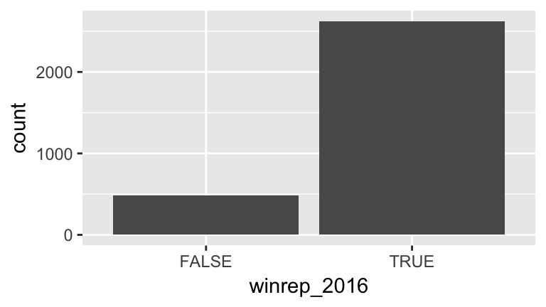
Explore the win column
Thewinrep_2016variable indicates whether or not the Republican (Trump) won the county in 2016, thus is categorical. Let’s construct both numerical and visual summaries of Trump wins/losses. (Before you do, what do you anticipate?)#Construct a table (a numerical summary) of the number of counties that Trump won/lost table(???) #Attach a library needed for ggplots library(???) #Construct a bar chart (a visual summary) of this variable. ggplot(???, aes(???)) ggplot(???, aes(???)) + geom_???()
- Explore vote percentages
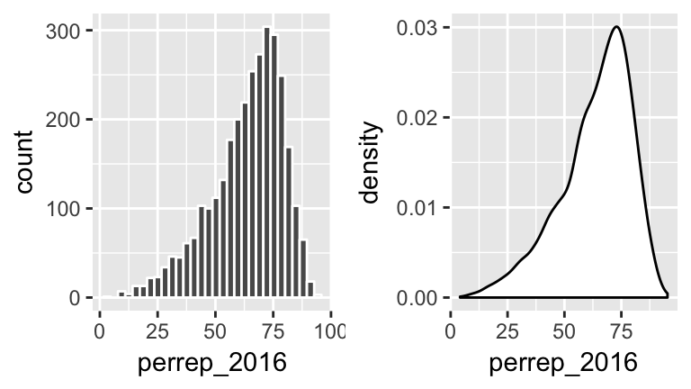
Theperrep_2016variable includes a bit more detail about Trump’s support in each county.Since it’s quantitative we need different tools to visually explore the variability in
perrep_2016. To this end, construct & interpret both a histogram and density plot ofperrep_2016. (Before you do, what do you anticipate?)ggplot(elect, aes(???)) #histogram ggplot(elect, aes(???)) + geom_???(color="white") #density plot ggplot(elect, aes(???)) + geom_???()Thus far, we have a good sense for how Trump’s support varied from county to county. We don’t yet have a good sense for why. What other variables (ie. county features) might explain some of the variability in Trump’s support from county to county? Which of these variables do you think will be the best predictors of support? The worst?
Visualizing Relationships
We’ve come up with a list of variables that might explain some of the variability in Trump’s support from county to county. Thus we’re interested in the relationship between:
- response variable: the variable whose variability we would like to explain
(Trump’s percent of the vote)
- predictors: variables that might explain some of the variability in the response
(percent white, per capita income, state color, etc)Our goal is to construct visualizations that allow us to examine/identify the following features of the relationships among these variables:
- relationship trends
- relationship strength (degree of variability from the trend)
- outliers in the relationship
A THOUGHT EXPERIMENT
Consider a subset of counties & variables:
| county | abb | perrep_2016 | perrep_2012 | winrep_2016 | StateColor |
|---|---|---|---|---|---|
| Elbert County | CO | 73.53 | 72.52 | TRUE | blue |
| Rockdale County | GA | 35.82 | 41.37 | FALSE | purple |
| Clay County | MN | 46.55 | 44.91 | TRUE | blue |
| McDonald County | MO | 80.15 | 72.84 | TRUE | purple |
| Alcorn County | MS | 79.95 | 75.11 | TRUE | red |
| Roger Mills County | OK | 87.94 | 83.75 | TRUE | red |
Before constructing visualizations of the relationship among any set of these variables, we need to understand what features these should have. As with univariate plots, the appropriate visualization also depends upon whether the variables are quantitative or categorical. In groups, draw a visualization of the relationship between the given pair of variables for the 6 counties above.
Visualize the relationship between
perrep_2016(the response) andperrep_2012(the predictor).Visualize the relationship between
perrep_2016(the response) andStateColor(the predictor). Think: how might we modify the below density plot ofperrep_2016to distinguish between counties in red/purple/blue states?ggplot(elect, aes(x=perrep_2016)) + geom_density()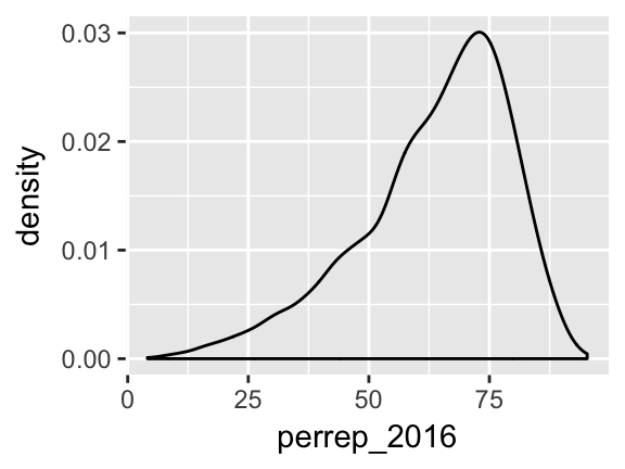
Visualize the relationship between Trump’s county-levels wins/losses
winrep_2016(the response) andStateColor(the predictor). Think: how might we modify the below bar plot ofwinrep_2016to distinguish between counties in red/purple/blue states?ggplot(elect, aes(x=winrep_2016)) + geom_bar()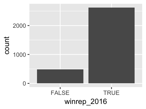
Basic Rules for Constructing Graphics
Instead of memorizing which plot is appropriate for which situation, it’s best to simply recognize patterns in constructing graphics:
Each quantitative variable requires a new axis. (We’ll discuss later what to do when we run out of axes!)
Each categorical variable requires a new way to “group” the graphic (eg: using colors, shapes, separate facets, etc to capture the grouping)
For visualizations in which overlap in glyphs or plots obscures the patterns, try faceting or transparency.
QUANTITATIVE vs QUANTITATIVE
Let’s start by exploring the relationship between Trump’s 2016 support (perrep_2016) and Romney’s 2012 support (perrep_2012), both quantitative variables.
Scatterplots & Glyphs
Bothperrep_2016andperrep_2012are quantitative, thus require their own axes. Traditionally, the response variable is placed on the y-axis. Once the axes are set up, each case is represented by a “glyph” at the coordinates defined by these axes.Plot a scatterplot of
perrep_2016vsperrep_2012with different glyphs: points or text.#just a graphics frame ggplot(elect, aes(y=perrep_2016, x=perrep_2012)) #add a layer with "point" glyphs ggplot(elect, aes(y=perrep_2016, x=perrep_2012)) + geom_point() #add a layer with symbol glyphs ggplot(elect, aes(y=perrep_2016, x=perrep_2012)) + geom_point(shape=3) #add a layer with "text" glyphs ggplot(elect, aes(y=perrep_2016, x=perrep_2012)) + geom_text(aes(label=abb))- Summarize the relationship between the Republican candidates’ support in 2016 and 2012. Be sure to comment on:
- the strength of the relationship (weak/moderate/strong)
- the direction of the relationship (positive/negative)
- outliers (In what state do counties deviate from the national trend? Explain why this might be the case)
- the strength of the relationship (weak/moderate/strong)
- Capture the trend with “smooths”
The trend of the relationship betweenperrep_2016andperrep_2012is clearly positive and (mostly) linear. We can highlight this trend by adding a model “smooth” to the plot.Add a layer with a model smooth:
ggplot(elect, aes(y=perrep_2016, x=perrep_2012)) + geom_point() + geom_smooth()- Construct a new plot that contains the model smooth but does not include the individual cases (eg: point glyphs).
- Notice that there are gray bands surrounding the blue model smooth line. What do these gray bars illustrate/capture and why are they widest at the “ends” of the model?
By default,
geom_smoothadds a smooth, localized model line. To examine the “best” linear model, we can specifymethod="lm":ggplot(elect, aes(y=perrep_2016, x=perrep_2012)) + geom_point() + geom_smooth(method="lm")
- Modify the scatterplots
As with univariate plots, we can change the aesthetics of scatterplots.- Add appropriate axis labels to your scatterplot. Label the y-axis “Trump 2016 support (%)” and label the x-axis “Romney 2012 support (%)”.
Change the color of the points.
ggplot(elect, aes(y=perrep_2016, x=perrep_2012)) +
    geom_point(color="brown")
Add some transparency to the points. NOTE:
alphacan be between 0 (complete transparency) and 1 (no transparency).ggplot(elect, aes(y=perrep_2016, x=perrep_2012)) + geom_point(alpha=0.5) ggplot(elect, aes(y=perrep_2016, x=perrep_2012)) + geom_point(alpha=0.2)Why is transparency useful in this particular graphic?
- Add appropriate axis labels to your scatterplot. Label the y-axis “Trump 2016 support (%)” and label the x-axis “Romney 2012 support (%)”.
- More scatterplots
2012 results aren’t the only possible predictor of 2016 results. Consider two more possibilities.- Construct a scatterplot of
perrep_2016andmedian_rent. Summarize the relationship between these two variables.
- Construct a scatterplot of
perrep_2016andpercent_white. Summarize the relationship between these two variables.
- Among
perrep_2012,median_rentandpercent_white, which is the best predictor ofperrep_2016? Why?
- Construct a scatterplot of
QUANTITATIVE vs CATEGORICAL
Consider a univariate histogram & density plot of perrep_2016:
To visualize the relationship between Trump’s 2016 support (perrep_2016) and the StateColor (categorical) we need to incorporate a grouping mechanism. Work through the several options below.
- Side-by-side density plots
Construct a density plot for each group.
ggplot(elect, aes(x=perrep_2016, fill=StateColor)) +
    geom_density()
Notice that
ggplotrandomly assigns colors to group based on alphabetical order. In this example, the random color doesn’t match the group itself (red/purple/blue)! We can fix this:ggplot(elect, aes(x=perrep_2016, fill=StateColor)) + geom_density() + scale_fill_manual(values=c("blue","purple","red"))The overlap between the groups makes it difficult to explore the features of each. One option is to add transparency to the density plots:
ggplot(elect, aes(x=perrep_2016, fill=StateColor)) +
    geom_density(alpha=0.5) +
    scale_fill_manual(values=c("blue","purple","red"))
Yet another option is to separate the density plots into separate “facets” defined by group:
ggplot(elect, aes(x=perrep_2016, fill=StateColor)) +
    geom_density(alpha=0.5) +
    scale_fill_manual(values=c("blue","purple","red")) +
    facet_wrap( ~ StateColor)
- Side-by-side histograms
Let’s try a similar strategy using histograms to illustrate the relationship betweenperrep_2016andStateColor.Start with the default histogram:
ggplot(elect, aes(x=perrep_2016, fill=StateColor)) +
    geom_histogram(color="white")
That’s not very helpful! Separate the histograms into separate facets for each
StateColorgroup.
- Just for fun: more options!
Density plots and histograms aren’t the only type of viz we might use…Construct side-by-side violins and side-by-side boxplots (see description below).
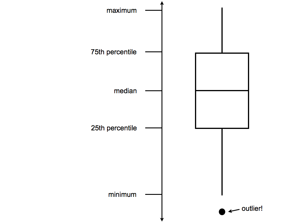
#violins instead
ggplot(elect, aes(y=perrep_2016, x=StateColor)) +
    geom_violin()

#boxes instead
ggplot(elect, aes(y=perrep_2016, x=StateColor)) +
    geom_boxplot()
Box plots are constructed from 5 numbers - the minimum, 25th percentile, median, 75th percentile, and maximum value of a quantitative variable:
In the future, we’ll typically use density plots instead of histograms, violins, and boxes. Explain at least 1 pro and 1 con of the density plot.
- Let’s not forget the most important purpose of these visualizations! Summarize the relationship between Trump’s 2016 county-level support among red/purple/blue states.
CATEGORICAL vs CATEGORICAL
Finally, suppose that instead of Trump’s percentage support, we simply want to explore his county-level wins/losses:
Specifically, let’s explore the relationship between winrep_2016 and StateColor, another categorical variable.
- Side-by-side bar plots
We saw above that we can incorporate a new categorical variable into a visualization by using grouping features such as color or facets. Let’s add information aboutStateColorto our bar plot ofwinrep_2016.Construct the following 4 bar plot visualizations.
#a stacked bar plot
ggplot(elect, aes(x=StateColor, fill=winrep_2016)) +
    geom_bar()

#a side-by-side bar plot
ggplot(elect, aes(x=StateColor, fill=winrep_2016)) +
    geom_bar(position="dodge")

#a proportional bar plot
ggplot(elect, aes(x=StateColor, fill=winrep_2016)) +
    geom_bar(position="fill")

#faceted bar plot
ggplot(elect, aes(x=StateColor, fill=winrep_2016)) +
    geom_bar() +
    facet_wrap( ~ winrep_2016)
Name one pro and one con of using the “proportional bar plot” instead of 1 of the other 3 options.
What’s your favorite bar plot from part a? Why?
Exercises
Hot dog warm-up!
In the annual Nathan’s hot dog eating contest, people compete to eat as many hot dogs as possible in 10 minutes. Data on past competitions were compiled by Nathan Yau for “Visualize This: The FlowingData Guide to Design, Visualization, and Statistics”:hotdogs <- read.csv("http://datasets.flowingdata.com/hot-dog-contest-winners.csv")- Construct a visualization of the winning number of hot dogs by year. THINK: Which is the response variable?
- Temporal trends are often visualized using a line plot. Add a
geom_line()layer to your plot from part a.
- Summarize your observations about the temporal trends in the hot dog contest.
- Construct a visualization of the winning number of hot dogs by year. THINK: Which is the response variable?
All but 2 of the past winners are from the U.S. or Japan:
table(hotdogs$Country)
##
##       Germany         Japan        Mexico United States
##             1             9             1            20
Use the following code to filter out just the winners from U.S. and Japan and name this
hotdogsSub. (Don’t worry about the code itself - we’ll discuss similar syntax later in the semester!)library(dplyr) hotdogsSub <- hotdogs %>% filter(Country %in% c("Japan","United States"))- Using a density plot approach without facets, construct a visualization of how the number of hot dogs eaten varies by country.
- Repeat part a using a density plot approach with facets.
- Repeat part a using something other than a density plot approach. (There are a few options!)
- Summarize your observations about the number of hot dogs eaten by country.
- The Bechdel test
Recall the “Bechdel test” data from the previous activity. As a reminder, the “Bechdel test” tests whether movies meet the following criteria:- there are \(\ge\) 2 female characters
- the female characters talk to each other
- at least 1 time, they talk about something other than a male character
In the fivethirtyeight.com article “The Dollar-And-Cents Case Against Hollywood’s Exclusion of Women”, the authors analyze which Hollywood movies do/don’t pass the test. Their data are available in thefivethirtyeightpackage:
library(fivethirtyeight)
data(bechdel)
In investigating budgets and profits, the authors “focus on films released from 1990 to 2013, since the data has significantly more depth since then.” Use the following code to filter out just the movies in these years and name the resulting data set
Beyond1990(don’t worry about the syntax):library(dplyr) Beyond1990 <- bechdel %>% filter(year >= 1990)- Construct a visualization that addresses the following research question: Do bigger budgets (
budget_2013) pay off with greater box office returns (domgross_2013)? In constructing this visualization, add a smooth to highlight trends and pay attention to which of these variables is the response.
- Using your visualization as supporting evidence, answer the research question.
- Part of the fivethirtyeight article focuses on how budgets (
budget_2013) differ among movies with different degrees of female character development (clean_test). Construct a visualization that highlights the relationship between these two variables. There are many options - some are better than others!
- Using your visualization as supporting evidence, address fivethirtyeight’s concerns.
- there are \(\ge\) 2 female characters
- Recreating a fivethirtyeight graphic
NOTE: The following exercise is inspired by a similar exercise proposed by Albert Kim, one of thefivethirtyeightpackage authors.
Return to the fivethirtyeight.com article and examine the plot titled “The Bechdel Test Over Time”.- Summarize the trends captured by this plot. (How has the representation of women in movies evolved over time?)
Recreate this plot! To do so, you’ll need to create a new data set named
newbechdelin which the order of the Bechdel categories (clean_test) and the year categories (yearCat) match those used by fivethirtyeight. Don’t worry about the syntax:library(dplyr) newbechdel <- bechdel %>% mutate(clean_test=factor(bechdel$clean_test, c("nowomen","notalk","men","dubious","ok"))) %>% mutate(yearCat=cut(year, breaks=seq(1969,2014,by=5)))Further, you’ll need to add the following layer in order to get a color scheme that’s close to that in the article:
scale_fill_manual(values = c("red","salmon","pink","steelblue1","steelblue4"))NOTE that your plot won’t look exactly like the authors’, but should be close to this:
- Summarize the trends captured by this plot. (How has the representation of women in movies evolved over time?)
Geographical Data: Point Processes
The
Starbucksdata, provided by Danny Kaplan, contains information about every Starbucks in the world:Starbucks <- read.csv("https://www.macalester.edu/~ajohns24/Data/Starbucks.csv")Starbucksincludes theLatitudeandLongitudeof each location. Construct a visualization of the relationship between these two. THINK: Which of these should go on the y-axis?The point pattern probably looks familiar! To highlight the geographical nature of this scatterplot, we can superimpose the points on top of a map. To this end, construct the following three maps using the
ggmapfunction in theggmaplibrary. NOTE: You might first have to install theggmappackage.library(ggmap) WorldMap <- get_map(location="Africa", zoom=2) ggmap(WorldMap) + geom_point(data=Starbucks, aes(x=Longitude,y=Latitude), alpha=0.2) US_map <- get_map(location="United States", zoom=3) ggmap(US_map) + geom_point(data=Starbucks, aes(x=Longitude,y=Latitude), alpha=0.2) TC_map <- get_map(location=c(lon=-93.1687,lat=44.9398)) ggmap(TC_map) + geom_point(data=Starbucks, aes(x=Longitude,y=Latitude))Re-examine the syntax. Explain the purpose of the
zoomargument and how it works.Construct a new map of Starbucks locations in your birth state (if you were born in the U.S.) or birth country (if you were born outside the U.S..)
Geographical Data: Measurement by Area
Geographical data needn’t be expressed by latitude & longitude. Reconsider theelectdata which included county-level election and demographic variables:elect <- read.csv("https://www.macalester.edu/~ajohns24/data/electionDemographics16.csv")Thus instead of plotting point locations of some occurrence (eg: Starbucks presence), we want to visualize county-level measurements. First load the following libraries. Make sure they are installed first!
library(choroplethr)
library(choroplethrMaps)
Construct the following three maps of Trump’s county-level support (
perrep_2016). Note thatcounty_choroplethrequires the variable of interest to be stored asvaluein theelectdata.#use but don't worry about this syntax elect <- elect %>% mutate(value=perrep_2016) #make the maps! county_choropleth(elect) county_choropleth(elect, state_zoom="minnesota") county_choropleth(elect, state_zoom="minnesota", reference_map = TRUE)Summarize the trends in the three plots above.
Make and summarize the trends in a national map of
winrep_2016, the indicator of whether or not Trump won each county. Don’t forget to first define this as yourvalueof interest:elect <- elect %>% mutate(value=winrep_2016)Make and summarize the trends in a national map of a different
electvariable of your choice!
3.4 Beyond Bivariate Relationships
3.4.1 Practice
Though far from a perfect assessment of academic preparedness, SAT scores are often used as one measurement of a state’s education system. The education data stored at https://www.macalester.edu/~ajohns24/data/sat.csv contain various education variables for each state:
head(education)
##        State expend ratio salary frac verbal math  sat  fracCat
## 1    Alabama  4.405  17.2 31.144    8    491  538 1029   (0,15]
## 2     Alaska  8.963  17.6 47.951   47    445  489  934 (45,100]
## 3    Arizona  4.778  19.3 32.175   27    448  496  944  (15,45]
## 4   Arkansas  4.459  17.1 28.934    6    482  523 1005   (0,15]
## 5 California  4.992  24.0 41.078   45    417  485  902  (15,45]
## 6   Colorado  5.443  18.4 34.571   29    462  518  980  (15,45]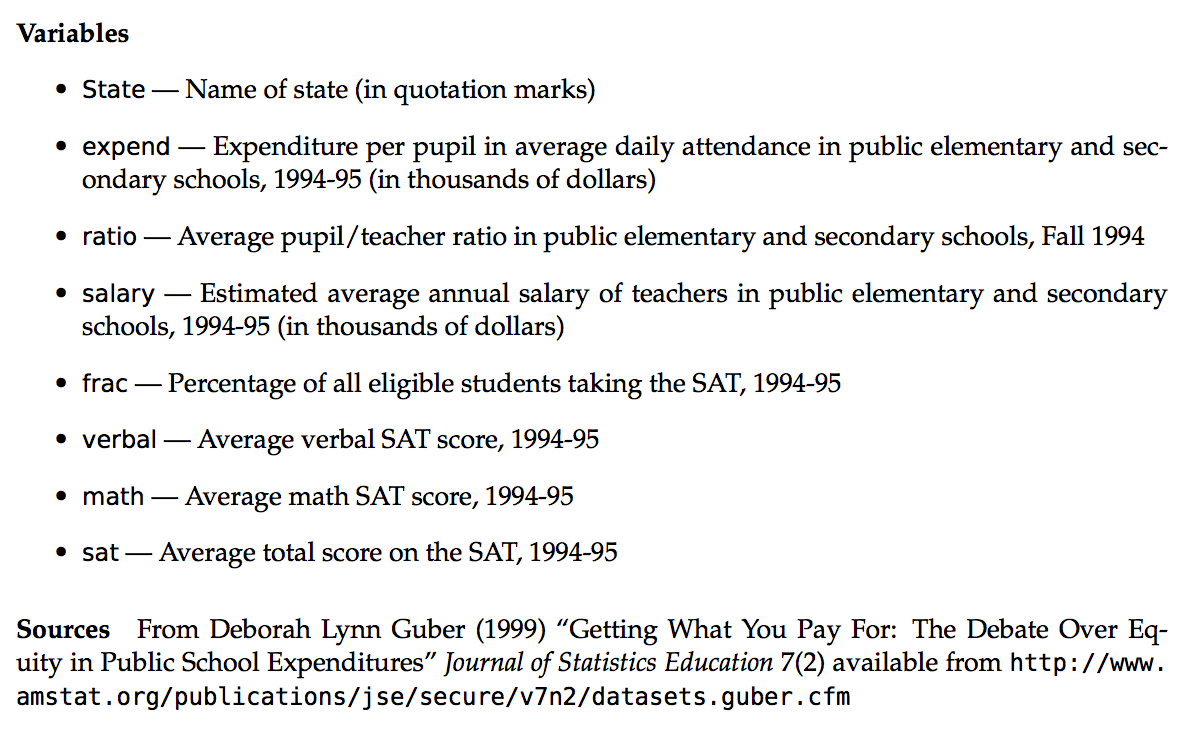
Getting Started
After importing the data (and saving it aseducation), construct visualizations that help you address the following research questions.Research question 1
ThefracCatvariable categorizes the fraction of a state’s students that take the SAT into low (below 15%), medium (15-45%), and high (at least 45%). How many states fall into each of these categories?Research question 2
To what degree do average SAT scores vary from state to state? What’s a typical SAT?Research question 3
To what degree does per pupil spending (expend) explain this variability? What about teachersalary? Is there anything that surprises you here?! NOTE: Include some model smooths to help highlight the trends.
A THOUGHT EXPERIMENT
Both expend and salary explain some of the variability in sat scores. So why not include both in a plot of sat? Or incorporate other variables that might illuminate the counterintuitive result. Let’s! Take a look at some of the data below:
| State | expend | ratio | salary | frac | verbal | math | sat | fracCat |
|---|---|---|---|---|---|---|---|---|
| Alabama | 4.405 | 17.2 | 31.144 | 8 | 491 | 538 | 1029 | (0,15] |
| Alaska | 8.963 | 17.6 | 47.951 | 47 | 445 | 489 | 934 | (45,100] |
| Arizona | 4.778 | 19.3 | 32.175 | 27 | 448 | 496 | 944 | (15,45] |
| Arkansas | 4.459 | 17.1 | 28.934 | 6 | 482 | 523 | 1005 | (0,15] |
| California | 4.992 | 24.0 | 41.078 | 45 | 417 | 485 | 902 | (15,45] |
| Colorado | 5.443 | 18.4 | 34.571 | 29 | 462 | 518 | 980 | (15,45] |
Before constructing visualizations of the relationship among any set of these variables, we need to understand what features these should have. In groups, draw a visualization of the relationship between the given set of variables.
Visualize how the variability in
sat(the response) can be explained byexpendandsalary(the predictors). Try to come up with at least 2 approaches. THINK: How did we visualizesatvsexpend? How can we adapt this to includesalaryinformation?Visualize how the variability in
sat(the response) can be explained byexpendandfracCat(the predictors). Try to come up with at least 2 approaches. THINK: How did we visualizesatvsexpend? How can we adapt this to includefracCatinformation?
VISUALIZING >2 QUANTITATIVE VARIABLES
- Scatterplots for >2 Quantitative Variables
Three dimensional scatterplots drawn on two dimensional surfaces are notoriously misleading. Consider the alternatives here.Construct each plot below and summarize the strategy that’s being used to include information about
expendin the scatterplot ofsatvssalary.#plot 1 ggplot(education, aes(y=sat, x=salary, color=expend)) + geom_point() + geom_smooth(se=FALSE, method="lm") #plot 2 ggplot(education, aes(y=sat, x=salary, size=expend)) + geom_point() + geom_smooth(se=FALSE, method="lm") #plot 3 ggplot(education, aes(y=sat, x=salary, color=cut(expend,2))) + geom_point() + geom_smooth(se=FALSE, method="lm") #plot 4 ggplot(education, aes(y=sat, x=salary, color=cut(expend,3))) + geom_point() + geom_smooth(se=FALSE, method="lm")Which of the plots is your favorite? Why?
Summarize the trivariate relationship between
sat,salary, andexpend.
INCORPORATING CATEGORICAL VARIABLES
- Construct a visualization of
satbyfracCat. Summarize the relationship between these two variables and explain why it makes intuitive sense.
fracCatandexpendboth explain some of the variability insatscores. Let’s incorporate both in our analysis.You have all the tools you need to construct a visualization of
satvsfracCatandexpend. Be sure to incorporate a model line:geom_smooth(method="lm")In all previous plots of
satvsexpend(withoutfracCat) we saw a negative relationship - SAT scores decrease as spending increases. What do you see now? What’s the relationship betweensatandexpendin states with a low fraction of students that take the SAT? States with a medium fraction? States with a high fraction?
- Simpson’s Paradox!
Wait a minute: In the scatterplot ofsatvsexpend, it appeared that the more states spend on students, the worse their SAT scores. However, when we account for the fraction of the state’s students that take the test, we see that SAT scores actually increase with per pupil expenditure. This phenomenon is known as a “Simpson’s Paradox”.To convince yourself that this phenomenon isn’t merely due to the way in which we categorized the low/medium/high
fracCatcategories, check out a plot ofsatvsexpendandfrac(the raw fractions):ggplot(education, aes(y=sat, x=expend, color=frac, size=frac)) + geom_point()To get a better sense of what’s going on here, plot the state names at their coordinates:
ggplot(education, aes(y=sat, x=expend, color=frac)) +
    geom_text(aes(label=State))
Putting all of this together, explain this Simpson’s Paradox. That is, why does it appear that SAT scores decrease as spending increases even though the opposite is true?
3.4.2 Exercises
The
US_births_2000-2014data within thefivethirtyeightpackage contains the number of U.S. births on each day from Jan 1, 2000 to Dec 31, 2014:#load the fivethirtyeight library suppressPackageStartupMessages(library(fivethirtyeight)) #load the births data data(US_births_2000_2014)For now, let’s focus on just 2014. Use the following code (but don’t worry about the syntax) to create the
Births2014data set:library(dplyr) Births2014 <- US_births_2000_2014 %>% filter(year==2014)Construct a univariate plot that allows you to visualize the variability in births from day to day in 2014.
The time of year might explain some of this variability. Construct a plot that illustrates the relationship between
birthsanddatein 2014. THINK: which of these should go on the y-axis?One goofy thing that stands out are the 2-3 distinct groups of points. Add a layer to this plot that explains the distinction between these groups.
Explain why you think births are lower in 1 of these groups than in the other.
There are some exceptions to the rule revealed in parts c & d, ie. some cases that should belong to group 1 but behave like the cases in group 2. Explain why these cases are exceptions - what explains the anomalies / why these are special cases?
Summarize your investigation in 1-2 sentences.
The data set
US_births_1994_2003data set contains similar data from the previous decade. Combine theUS_births_1994_2003andUS_births_2000_2014into 1 data table using the following code (don’t worry about the syntax):allyears <- full_join(US_births_1994_2003, US_births_2000_2014)Construct 1 graphic that illustrates births trends across 1994-2014 and days of the week using
geom_point().Construct 1 graphic that illustrates births trends across 1994-2014 and days of the week using
geom_smooth()(withoutgeom_point()).Summarize your investigation in 1-2 sentences. Be sure to comment on both the common seasonal trends within years as well as trends across the years.
One of the focuses of the related fivethirtyeight.com article was birth trends on Friday the 13th (of which some people are superstitious). Use the following code to construct a data set that only contains Friday births and includes a variable
fri13which indicates whether the Friday falls on the 13th day of the corresponding month: Don’t worry about the syntax:frionly <- allyears %>% filter(day_of_week=="Fri") %>% mutate(fri13=(date_of_month == 13))Using the
frionlydata, construct a plot that illustrates the distribution ofbirthsamong Fridays that fall on & off the 13th. Comment on whether you see any evidence of superstition.
Stacking
ThedannyVizdata, a tribute to Danny Kaplan, contains enrollment data for statistics-related courses at Mac from 2000-2016:dannyViz <- read.csv("https://www.macalester.edu/~ajohns24/data/dannyViz.csv")So that RStudio recognizes the
Coursenumbers at categories, be sure to run the following code:dannyViz$Course <- as.factor(dannyViz$Course)Construct a single visualization of how enrollments (
Total) in eachCoursehave fluctuated byYear. Since this is temporal data, it makes sense to usegeom_line()instead ofgeom_point(). NOTE: 110 has turned into the current 112 in which you sit!That plot is nice for summarizing the trends of each individual course. However, it’s tough to get a sense of the cumulative enrollments in these courses over time. To this end, construct the following plot using
geom_area(). Use this to summarize the overall and individual trends in statistics enrollments.ggplot(dannyViz, aes(x=Year, y=Total, fill=Course)) + geom_area(color="black")The following data, motivated by the work of Nathan Yau in “Visualize This” and provided by http://flare.prefuse.org/, summarize occupation trends from 1850-2000:
jobs <- read.csv("https://www.macalester.edu/~ajohns24/Data/jobtrends.csv")Construct a
geom_area()visualization of occupation trends over time. Facet these bysex(1=male,2=female).Summarize 3 interesting trends from this visualization.
3.5 Visualization Wrap-Up
3.5.1 Practice
Now that we’ve learned the basics of constructing visualizations, let’s consider using visualizations to tell a story. Here are some examples:
- Tell a Story About the Bechdel Test
As a class, let’s tell a story about movies that do/don’t pass the Bechdel test using the following prompts as inspiration:- How many movies fail/pass? In what way?
- Why? Is it because movies that fail the test had more money?
- What about the return on spending?
To get you started:#load the data library(fivethirtyeight) library(dplyr) data(bechdel) #wrangle the data (don't worry about the syntax) bechdel <- mutate(bechdel, domgains=domgross_2013/budget_2013, intgains=intgross_2013/budget_2013)NOTE: To deal with the extreme right skew in budgets and gross earnings, you may need to convert the x-axis and/or y-axis to the log scale:
#add at the end of a ggplot scale_x_log10() scale_y_log10() - How many movies fail/pass? In what way?
- Tell a Story About Jam of the Week
Online spaces now augment physical spaces where people share, critique, and study musical performance. This research studies “Jam of the Week”, an online Facebook community with over 50,000 members.

The
jotwdata contain the first 30,000+ posts to the Facebook group:Each row represents a single jam posted to the group. Variables include:jotw <- read.csv("https://www.macalester.edu/~ajohns24/data/jam_of_the_week.csv")gender= gender of the musician in the post
num_reactions,num_comments, etc = number of reactions to, comments on, etc the post
year_day,week_day,hour= indicators of when the jam was posted
If you’re curious about the other variables, talk to the walking code book (Shilad).
Working with the people around you, tell a story about Jam of the Week. In doing so, consider the following research question as a prompt: To what extent does online behavior adhere to or transcend existing biases related to gender?
3.5.2 Exercises
In January 2017, fivethirtyeight.com published an article on hate crime rates across the US. A tidied up version of their data are available at
- Getting Started
Load the data and store it as
US_crime.What are the units of observation and how many observations are there?
- These
US_crimedata (which you should use for each exercise) were generated from thehate_crimesdata set in thefivethirtyeightpackage. Examine the codebook for thehate_crimesdata. Note thatUS_crimecontains these same variables plus 3 more:crimes_pre= average daily hate crimes per 100,000 population (2010-2015)
crimes_post= average daily hate crimes per 100,000 population (November 9-18, 2016)
crimes_diff= difference in the average daily hate crimes per 100,000 population after the election vs before the election (crimes_post - crimes_pre)trump_win= an indicator of whether Trump won
In comparing hate crime rates before and after the election, why is it better to examine
crimes_prevscrimes_postthanavg_hatecrimes_per_100k_fbivshate_crimes_per_100k_splc?
- Trends in hate crimes
Explain why, if we want to study possible connections between hate crime rates and the election, we should use
crimes_diffinstead ofcrimes_postin our analysis.- Write a mini-story with 3 visualizations and 1-2 sentences per visualization that examines the following relationships:
- (univariate) variability in
crimes_diff(be sure to note how these values compare to 0 & the contextual significance of this);
- the relationship between
crimes_diffvstrump_win
- the relationship between
crimes_diffvsshare_vote_trump
- the relationship between
crimes_diffvsgini_indexandtrump_win
- (univariate) variability in
MULTIVARIATE VISUALIZATIONS
There are several variables we haven’t considered yet! Instead of cherry picking 2-3 variables at a time, we can visualize all at once. Before you get started, use the following syntax to eliminate some redundant variables and give the data row names. (Don’t worry about the syntax itself!)#make a copy of US_crime US_crime_new <- US_crime #treat states as row names row.names(US_crime_new) <- US_crime_new$state #take out some variables library(dplyr) US_crime_new <- select(US_crime_new, -c(state,median_house_inc,hate_crimes_per_100k_splc,avg_hatecrimes_per_100k_fbi,crimes_pre,crimes_post,trump_win))Confirm that your dimensions match those below:
dim(US_crime_new)
## [1] 51  9
Heat map (plain)
Use the syntax below to construct a heat map. Note that each variable (column) is scaled to indicate states (rows) with high values (pink) to low values (blue). With this in mind you can scan across rows & across columns to visually assess which states & variables are related, respectively.crime_mat <- data.matrix(US_crime_new) heatmap(crime_mat, Rowv=NA, Colv=NA, scale="column", col=cm.colors(256))Heat map with row clusters
It can be tough to identify interesting patterns by visually comparing across rows and columns. Including dendrograms helps to identify interesting clusters. First construct a heat map which identifies interesting clusters of rows (states). Comment on 2 interesting clusters. (Eg: do you note any regional patterns?)heatmap(crime_mat, Colv=NA, scale="column", col=cm.colors(256))Heat map with column clusters
We can also construct a heat map which identifies interesting clusters of columns (variables). Comment on 2 interesting clusters. (Eg: Which variable seems to be the most indicative of Trump’s support?)heatmap(crime_mat, Rowv=NA, scale="column", col=cm.colors(256))Star plots
There’s more than one way to visualize multivariate patterns. Construct the following 2 star plot visualizations. Like heat maps, these visualizations indicate the relative scale of each variable for each state. With this in mind, use the star maps to identify which state is the most “unusual”.stars(crime_mat, flip.labels=FALSE, key.loc=c(15,1.5)) stars(crime_mat, flip.labels=FALSE, key.loc=c(15,1.5), draw.segments=TRUE)