5 Activities: EDA
5.1 EDA Case Study: Flight Delays
Suggested readings: * Grolemund and Wickham’s Exploratory Data Analysis
Required packages:
library(tidyverse)
library(ggplot2)
library(ggmap)
We have introduced the major data manipulation and visualization techniques you will use in this class. Now we will take a moment to practice them.
In a real data science project, you will typically have a question or idea brought to you: How are people interacting with the new version of my software? How is weather in St. Paul changing in the last decade? What type of people are most likely to enroll in Obamacare?
You will sometimes be given a dataset when asked one of these questions, or more often, a general description of the data you could get if you talked to the right people or interacted with the right software systems.
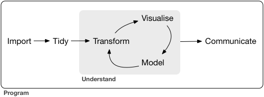
In this section, we will talk about Exploratory Data Analysis (EDA), a name given to the process of 1) “getting to know” a dataset, and 2) trying to identify any meaningful insights within it. Grolemund and Wickham visualize this process with a simple diagram:
We view the process similarly:
- Understand the basic data that is available to you.
- Describe the variables that seem most interesting or relevant.
- Formulate a research question.
- Analyze the data related to the research question, starting from simple analyses to more complex ones.
- Interpret your findings refine your research question, and return to step 4.
Let’s practice these steps using data about flight delays from Kaggle.
Understanding the basic data
Start by understanding the data that is available to you. If you have a codebook you have struck gold! If not (the more common case), you’ll need to do some detective work that often involves talking to people. At this stage, ask yourself:
- Where does my data come from? How was it collected?
- Is there a codebook? If not, how can I learn about it?
- Are there people I can reach out to who have experience with this data?
Next, you need to load the data and clean it. This can be tricky, and we will cover it later in the course. Once the data is loaded, ask yourself about each table:
- What is an observation?
- How many observations are there?
- What is the meaning of each variable?
- What is the type of each variable (date, location, string, factor, number, boolean, etc.)?
Finally, ask yourself about the relationships between tables:
- What variables link between the tables?
Let’s start by doing this with our dataset.
- Download and unzip the dataset. Keep track of where it is on your hard drive. The code below assumes that it is in a “flight-delays” directory within the same folder as your RMarkdown, but you will need to adjust this.
- Look at the size of each file in your file explorer.
flights.csvis BIG so we will sample it when we read it in. Beware: this is not a random sample. After your data analysis is finished, you may want to - In the code below, note that the path to the data will be slightly different on your computer.
airlines <- read_csv("flight-delays/airlines.csv")
airports <- read_csv("flight-delays/airports.csv")
flights <- read_csv("flight-delays/flights.csv", n_max = 100000)
Try to understand the data tables in our example. Look carefully for a codebook! Once you have it, answer each of the questions above.
Describe the data
Now that we have the data loaded, let’s perform some simple analysis on each of the fields. Before we get started, we need to understand NA values. This is important, because many aggregating functions like mean or sum get confused if you have an NA in a variable:
sum(c(3, 4, 5))   # gives 12
## [1] 12
mean(c(3, 4, 5))   # gives 4
## [1] 4
sum(c(3, 4, 5, NA))   # gives NA
## [1] NA
mean(c(3, 4, 5, NA))   # gives NA
## [1] NA
sum(c(3, 4, 5, NA), na.rm=TRUE)   # gives 12
## [1] 12
mean(c(3, 4, 5, NA), na.rm=TRUE)   # gives 4
## [1] 4colSums(is.na(flights))
## YEAR MONTH DAY
## 0 0 0
## DAY_OF_WEEK AIRLINE FLIGHT_NUMBER
## 0 0 0
## TAIL_NUMBER ORIGIN_AIRPORT DESTINATION_AIRPORT
## 167 0 0
## SCHEDULED_DEPARTURE DEPARTURE_TIME DEPARTURE_DELAY
## 0 2298 2298
## TAXI_OUT WHEELS_OFF SCHEDULED_TIME
## 2371 2371 0
## ELAPSED_TIME AIR_TIME DISTANCE
## 2613 2613 0
## WHEELS_ON TAXI_IN SCHEDULED_ARRIVAL
## 2440 2440 0
## ARRIVAL_TIME ARRIVAL_DELAY DIVERTED
## 2440 2613 0
## CANCELLED CANCELLATION_REASON AIR_SYSTEM_DELAY
## 0 97611 65375
## SECURITY_DELAY AIRLINE_DELAY LATE_AIRCRAFT_DELAY
## 65375 65375 65375
## WEATHER_DELAY
## 65375Here’s an example analysis of a few different types of variables: For each of these analyses, think about the following:
- What do you see that is interesting?
- What might be causing the interesting findings?
- How could you figure out whether your ideas are correct?
Study airport state. What do you notice?
airports %>%
    group_by(STATE) %>%
    summarize(count=n()) %>%
    arrange(desc(count))
## # A tibble: 54 x 2
##    STATE count
##    <chr> <int>
##  1    TX    24
##  2    CA    22
##  3    AK    19
##  4    FL    17
##  5    MI    15
##  6    NY    14
##  7    CO    10
##  8    MN     8
##  9    MT     8
## 10    NC     8
## # ... with 44 more rows
head(flights)
## # A tibble: 6 x 31
##    YEAR MONTH   DAY DAY_OF_WEEK AIRLINE FLIGHT_NUMBER TAIL_NUMBER
##   <int> <int> <int>       <int>   <chr>         <int>       <chr>
## 1  2015     1     1           4      AS            98      N407AS
## 2  2015     1     1           4      AA          2336      N3KUAA
## 3  2015     1     1           4      US           840      N171US
## 4  2015     1     1           4      AA           258      N3HYAA
## 5  2015     1     1           4      AS           135      N527AS
## 6  2015     1     1           4      DL           806      N3730B
## # ... with 24 more variables: ORIGIN_AIRPORT <chr>,
## #   DESTINATION_AIRPORT <chr>, SCHEDULED_DEPARTURE <chr>,
## #   DEPARTURE_TIME <chr>, DEPARTURE_DELAY <int>, TAXI_OUT <int>,
## #   WHEELS_OFF <chr>, SCHEDULED_TIME <int>, ELAPSED_TIME <int>,
## #   AIR_TIME <int>, DISTANCE <int>, WHEELS_ON <chr>, TAXI_IN <int>,
## #   SCHEDULED_ARRIVAL <chr>, ARRIVAL_TIME <chr>, ARRIVAL_DELAY <int>,
## #   DIVERTED <int>, CANCELLED <int>, CANCELLATION_REASON <chr>,
## #   AIR_SYSTEM_DELAY <int>, SECURITY_DELAY <int>, AIRLINE_DELAY <int>,
## #   LATE_AIRCRAFT_DELAY <int>, WEATHER_DELAY <int>
head(airlines)
## # A tibble: 6 x 2
##   IATA_CODE                AIRLINE
##       <chr>                  <chr>
## 1        UA  United Air Lines Inc.
## 2        AA American Airlines Inc.
## 3        US        US Airways Inc.
## 4        F9 Frontier Airlines Inc.
## 5        B6        JetBlue Airways
## 6        OO  Skywest Airlines Inc.
head(airports)
## # A tibble: 6 x 7
##   IATA_CODE                             AIRPORT        CITY STATE COUNTRY
##       <chr>                               <chr>       <chr> <chr>   <chr>
## 1       ABE Lehigh Valley International Airport   Allentown    PA     USA
## 2       ABI            Abilene Regional Airport     Abilene    TX     USA
## 3       ABQ   Albuquerque International Sunport Albuquerque    NM     USA
## 4       ABR           Aberdeen Regional Airport    Aberdeen    SD     USA
## 5       ABY  Southwest Georgia Regional Airport      Albany    GA     USA
## 6       ACK          Nantucket Memorial Airport   Nantucket    MA     USA
## # ... with 2 more variables: LATITUDE <dbl>, LONGITUDE <dbl>
Visualize airports in the US using a scatterplot. You could be fancier and use ggmap if you wanted.
ggplot(airports, aes(x=LONGITUDE, y=LATITUDE)) +
geom_point()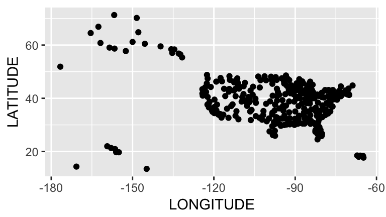 Visualize flight distance, a quantitative variable:
ggplot(flights, aes(x=DISTANCE)) +
    geom_freqpoly() # like histogram, but uses a line.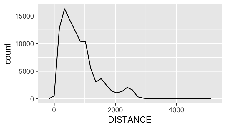
Visualize week time, an ordinal variable. This is a bit tricky, and there are many ways to do this.
We can try looking at day:
ggplot(flights, aes(x=DAY_OF_WEEK)) +
    geom_bar()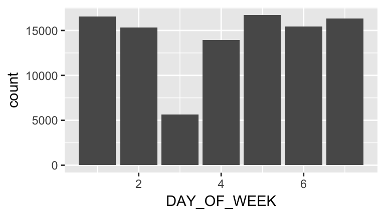
Or time of day. Why does the following work for hour?
hour <- round(as.integer(flights$DEPARTURE_TIME) / 100)

ggplot(flights, aes(x=hour)) +
    geom_bar()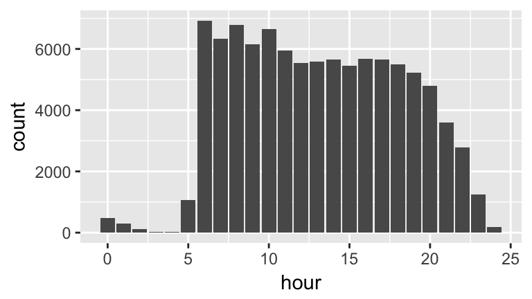
Or we can try and put both day and hour together:
weekday <- as.integer(flights$DAY_OF_WEEK)

flightsWithWeekSegments <-
    flights %>%
    mutate(dayAndHour=weekday + hour / 24)

ggplot(flightsWithWeekSegments, aes(x=dayAndHour)) +
    geom_freqpoly()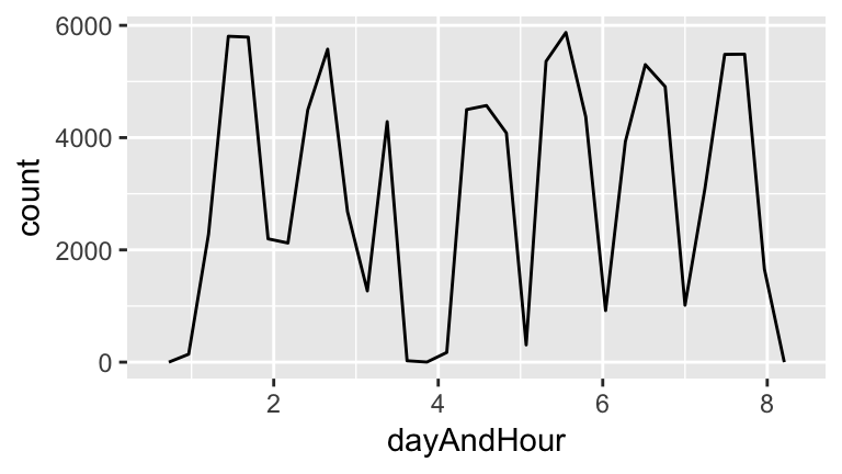
- Exercise 1. Analyze other variables: Pick a selection of other variables and study them. Try to choose variables that seem potentially interesting and vary in datatype.
Formulate a research question
There is a ton of data here, and it can be easy to be overwhelmed. How should we get started? One easy idea is to brainstorm ideas for research questions, and pick one that seems promising. This process is much easier with more than one brain! You will often be working off of a broad question posed by your business, organization, or supervisor, and be thinking about how to narrow it down.
In small groups, brainstorm some research questions. Note that at this stage your questions can be relatively broad.
We are going to go after the broad research question:
Which flights are most likely to be delayed?What do we first need to be able to measure to study this question? The question is about a delay? What variable will we rely on for a delay? What constitutes a delay?
There are many possible ways to operationalize this question, but let’s start easy:
Are there certain days of the week that are more likely to be delayed?We can start by looking at the relationship between delays and weekday. This is a bivariate visualization between a categorical variable (weekday) and a continuous variable (delay). Note that R thinks DAY_OF_WEEK is an integer. We must fix this!
class(flights$DAY_OF_WEEK) # it's an integer. let's fix this!
## [1] "integer"
flights$DAY_OF_WEEK <- factor(flights$DAY_OF_WEEK)

ggplot(flights, aes(x=DAY_OF_WEEK, y=ARRIVAL_DELAY)) +
    geom_boxplot() +
    scale_y_continuous(limits=c(-100, 200)) # don't focus on outliers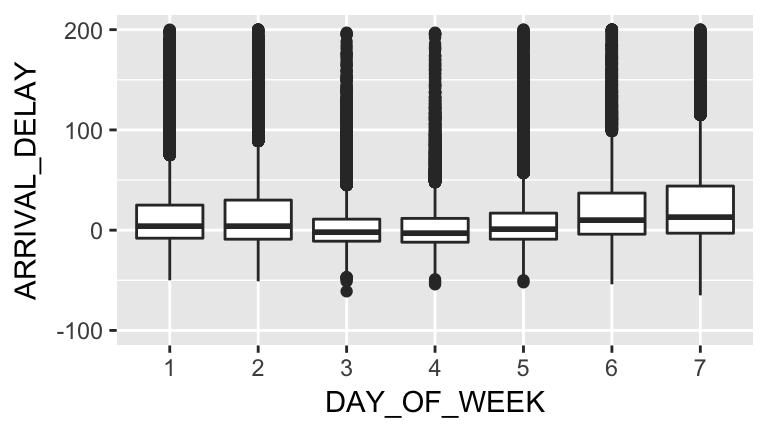
Talk about the following questions: * What patterns do you see? * Why might they be occurring? * How would you communicate your findings to your friends who aren’t familiar with statistics or data science?
One important downside to the graph above is that it is fairly complex. If somebody has not seen boxplots before, they may have a difficult time interpreting it.
Is there a way we could simplify the graph? What if we calculated the percentage of flights that had delays. We would first need to define delays. To get some insight into this, let’s see what delays look like in our dataset:
ggplot(flights, aes(x=ARRIVAL_DELAY)) +
    geom_freqpoly() +
    scale_x_continuous(limits = c(-10,60))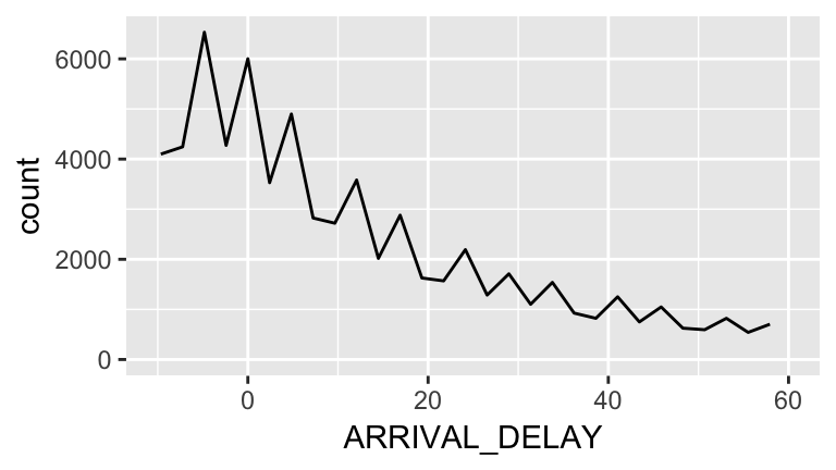
We see a steady downward trend with no clear cutoffs, but there looks to be a little dip around 20 minutes. We will choose this as our definition of a delayed flight:
flights <-
    flights %>%
    mutate(delayed=ARRIVAL_DELAY >= 20)
delayed <-
flights %>%
filter(delayed)
ggplot(delayed, aes(x=DAY_OF_WEEK)) +
geom_bar()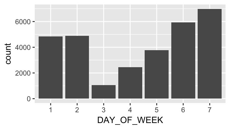
Note that this isn’t really surprising, because it follows the overall trend. What we want to know is the percentage of flights that are delayed. How do we do this?
One trick that helps is booleans (TRUE / FALSE variables) can be treated as ones and zeros arithmetically:
sum(c(TRUE, TRUE, FALSE)) # = 2 because there are two TRUEs
## [1] 2
mean(c(TRUE, TRUE, FALSE)) # = 0.666 because two-thirds are TRUE
## [1] 0.6666667
So we want to know the proportion of flights for each weekday that are delayed, which is the same as taking the mean of the delayed variable for each of those flights:
by_day <-
    flights %>%
    filter(!is.na(delayed)) %>%
    group_by(DAY_OF_WEEK) %>%
    summarize(fraction_delayed=mean(delayed))

ggplot(by_day, aes(x=DAY_OF_WEEK, y=fraction_delayed)) +
    geom_col()  # we could also use geom_point, but not geom_bar. Why?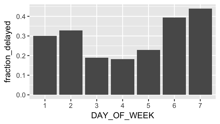
Exercise 2. Continue studying the original broad research question: Which flights are most likely to be delayed? or pose a new research question and analyze it. At the end of class, put your favorite chart in this Google Doc, along with a caption.